- Category:
- All
- Design
- Illustration
- Manga
- Craft
Suzu Kawana http://www.pixiv.net/member.php?id=1542539
Tokyo native Ms. Kawana is a manga illustrator known for her colorful artworks using Copic. She is excellent for capturing and expressing many emotions of teenage girls and even created her own character called "hana*". Also her distinctive and dramatic use of white background accentuates the beauty of a character in the picture.
She is actively releasing her works both on the web and in various manga events.
We did an interview with Ms. Kawana, a creator of popular character "hana*", about her engagement with Copic.
"I can use it immediately in a moment of opening a cap."
When did you first start using Copic markers and what made you decide to use them?
When I was in fifth grade, I purchased some Copics and Comic Markers at the store. I can still remember the first time I discovered Copic. I was like "finally I found what I've been looking for!".
What was the color you choose at that time? Was there a specific reason?
It was E02, which is a relatively dark flesh color. I picked that color without any particular reasons. Maybe I just liked the color of cap (laughter).
What do you love the most about Copic?
Copic doesn't require complicated preparations at all. In a moment of opening a cap, I can use it immediately. I'm a bit of a lazy person, so this is very important! Of course I love the vivid colors Copic provides. Also these markers can be refilled! Got to love Copic refills.
What have been your favorite color lately?
My current favorite color is Y21. In many cases we tend to choose brighter tone when applying the yellow, but the muted tone of Y21 is very useful. I often use the color gradation of Y21 to Y000 as the base color of my artwork.
Is there your own distinctive techniques or methods?
Umm, I'm always trying to add some "depth" to my work by layering many colors... In that process, I research the most effective way to use the color I want to emphasize. For example, If I want to make a pale pink stand out, I would use loud color for it's shadow to enhance contrast... something like that.
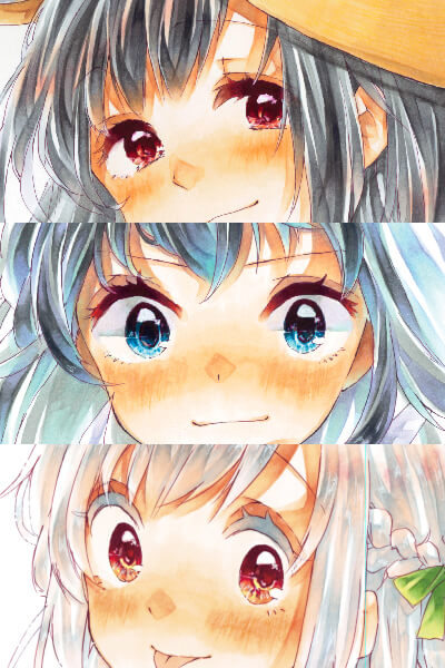
The eyes are super important!
In the process of creating your project, is there any specific parts you particularly enjoy to color? Or which part requires extra attention?
Coloring the skin tone is fun because if I mess up, it can't be redone! For me, the eyes are among the most important features. I must be totally concentrated when I color the eyes. If I fail on the coloring of the eyes, I'd throw away the project even if the other parts were completed already. So I often finish the eyes in the relatively early stages of process.
Is there's something you're using as a reference for creating your project?
I say "ain't nothing like the real thing". Nothing better than having the physical thing (even if it's a toy or imitation) in your hands and taking a close look. When I'm drawing a flower, I'd buy some flowers and dissect them to observe. Or maybe I'd go to some beautiful spot filled with full bloomed flower and take pictures. If it' s difficult, I'd go to the library and research all day. When I'm drawing a dinosaur I'd go to a museum. When I'm drawing a fish, I'd go to an aquarium or sea - That's what I'm doing to get inspirations!
From which part do you begin the coloring process usually? Is there a particular part?
The main features of my illustration is "girls" so I always start the coloring with their skintone, unless in unusual circumstances. This is not an absolute routine, though. When I'm trying to layer the two colors for skintone, I'm not able to get the strong contrast if I don't apply the second color after the first color has dried enough. I'll have to wait for a while, but I'd rather proceed with other parts than just sit there doing nothing and waste time.
How long do you normally spend to finish a piece of artwork?
Many people have told me that I'm quick about work, but I'm not sure. It depends on the size of project, an environment surrounding me and my motivation!
How do you choose the paper? What type of paper do you like best?
I like affordable paper which maintains a stable supply. I want to use the same paper over the long term without any fear of production stoppage. Thickly one is not my kind of paper. I like the paper with lighter feel.
What do you use for inking?
I'm currently using Copic Mutiliner Wine, because the pen I used to love has already been discontinued. The best thing about Wine color is, it makes the skintone of character look brighter. It would be perfect if the color tone is more reddish and dark... Please think about it (laughter).
Is there any other things you are using along with Copic?
Oil-based colored pencils. I can't complete my project without it these days.
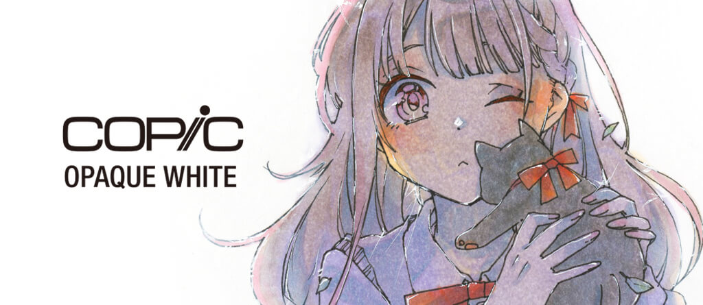
About the "white background" and expressing backlight
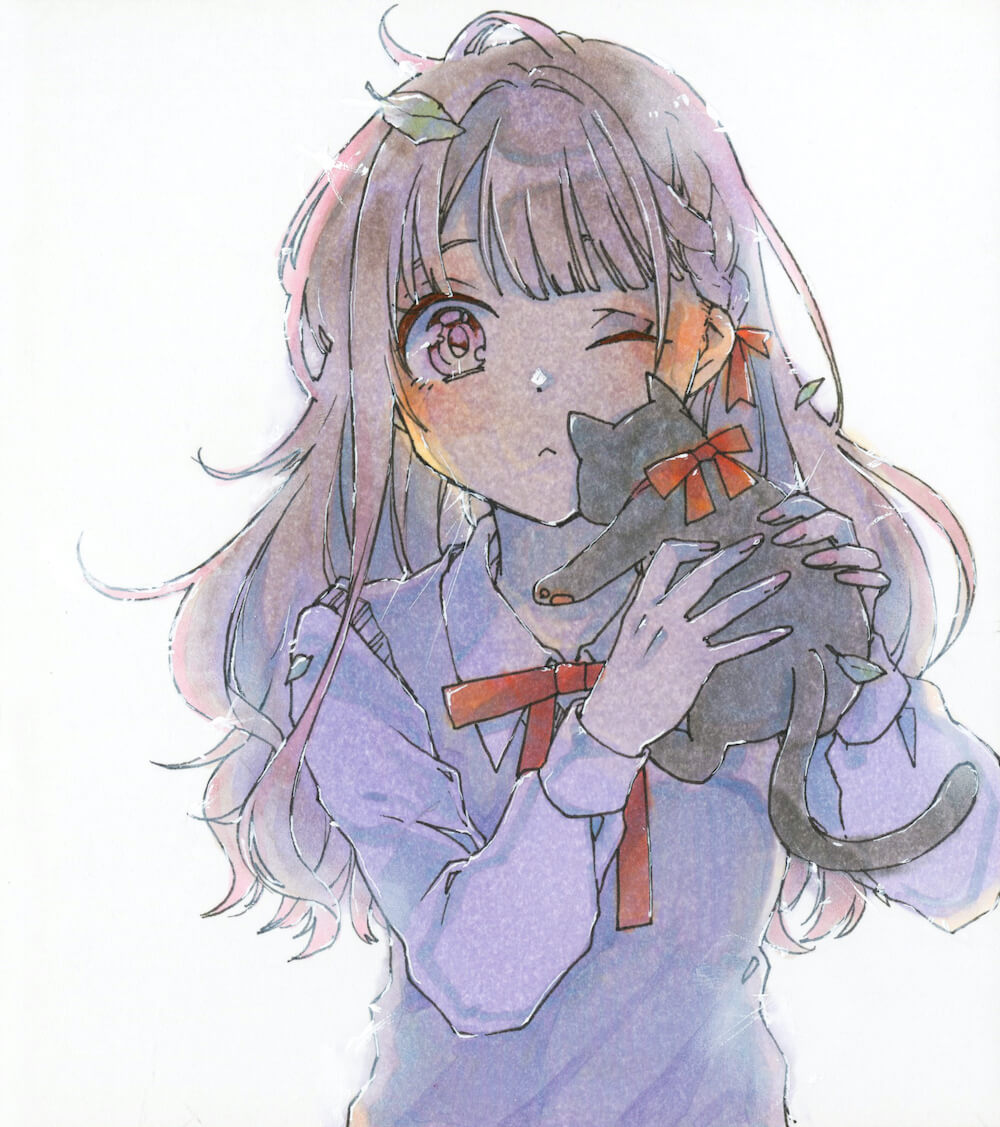
Could you tell us about the illustration you drew for us this time?
In this piece I was trying to express the backlight. As you can see, this girl is standing with her back to a light source behind. I applied Opaque White on the objects I'd like to add the backlight effect, and spread it by my finger along the direction of a ray of light. I used a illustration board made especially for Copic here. Opaque White will be spread on the surface of paper very well so even if a certain amount of White is placed, the subjects beneath would become seen through when I spread the White thinly. Finally I added thin white lines using the brush as if the strong light is flooded from the back of objects.
What do you think about the Opaque White's brush?
This brush is really good for drawing the fine line. You can draw the clear line without applying it over and over again because Opaque White won’t bleed into Copic ink. Of course you can use Opaque White with a dip pen as well in order to get different touchs. Opaque White works great for covering up the mistakes or adding highlights, but it's more than that actually. This product is a tool offers the new ways of using "white" - it will extend your range of expression. Opaque White is a wonderful tool which spicing up your project created with Copic in various ways, no matter the base color is strong or pale.
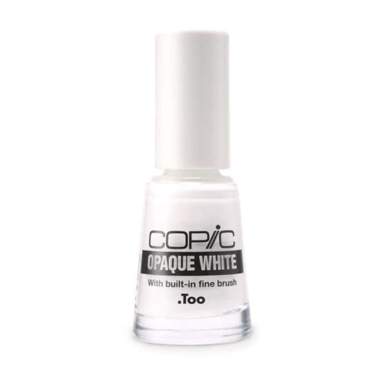
Copic Opaque White with Brush
This water-based, white pigment ink works well on Copic ink and allows for sharp line definition. Perfect for correcting the mistake or adding final touches to your project. Attached fine liner brush is ideal for finishing highlights and other effects. Large size 10ml bottle (with no brush) is also available.