- Category:
- All
- Design
- Illustration
- Manga
- Craft
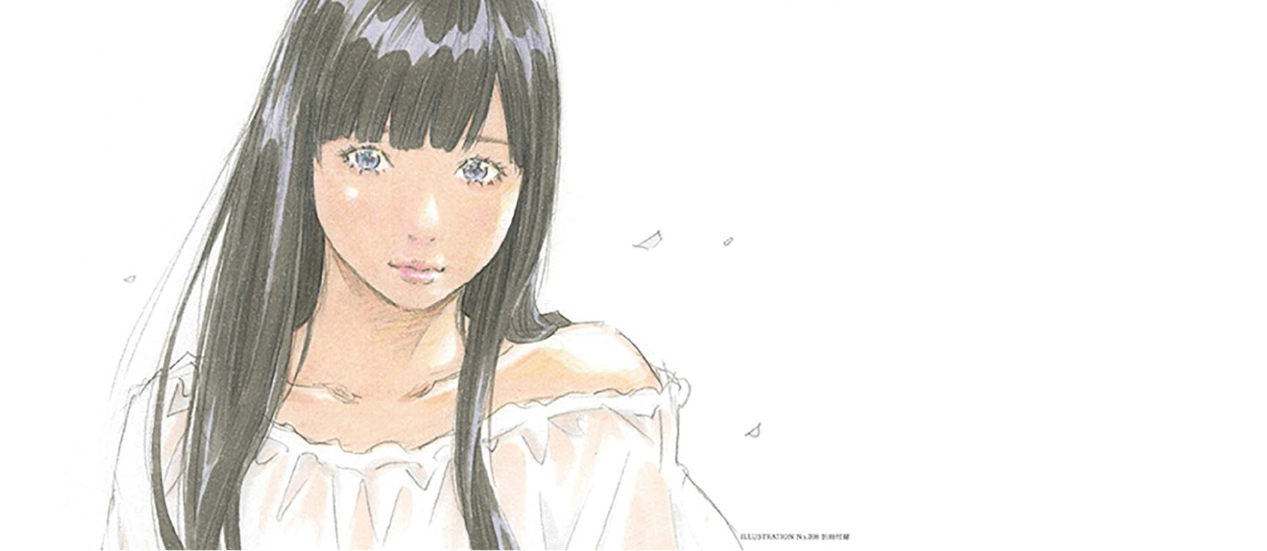
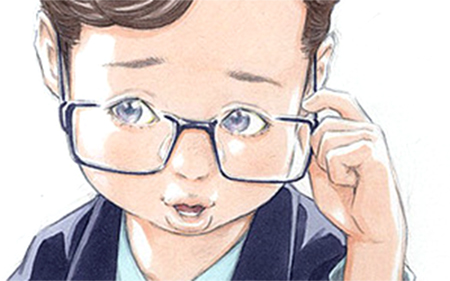
Eisaku Kubonouchi
Mr. Kubonouchi is a Japanese manga artist/illustrator born in Kochi, Japan.
He is most famous for his manga series such as "Tsurumoku Dokushin Ryo", "Watanabe" and "Chocolat", which were made into the film and TV dramas.
With his unique style, Mr. kubonouchi's work attracts a wide range of people.
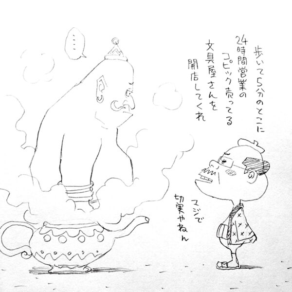
"C'mon genie, I seriously need a shop selling Copic markers for 24 hours a day, within 5 minutes walk of my place!!"
We did an interview with a big fan of Copic markers, Mr. Kubonouchi to find out why he started using Copic, how he uses other art materials in combination with Copic, and his belief about drawing the illustrations.
About Copic
— When did you first start using Copic markers and what made you decide to use them?
I used to color the manuscript withs tube paints but became weary of using them... About 20 years ago, I discovered the new art material called Copic marker, and decided to give it a try.
— What do you love the most about them?
Rich color variations and the useful features of brush nib. I stock 2pcs each of all colors in case the ink runs out. Always.
I love the brush nib because I could draw a variety of lines by adjusting the angle or drawing pressure.
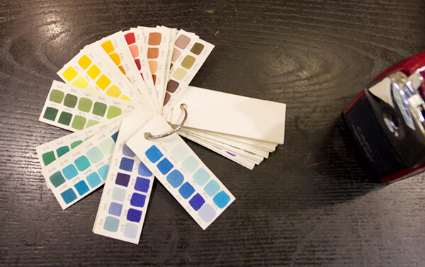
— I heard that you made the color chart on your own.
Yeah, I made my own color chart so that I will not have to apply the color each time for checking. I used the ordinary flash cards which can be purchased everywhere, but if you make a color chart of your own, you'd better to choose the favorite paper you're using usually.
— What color do you use frequently?
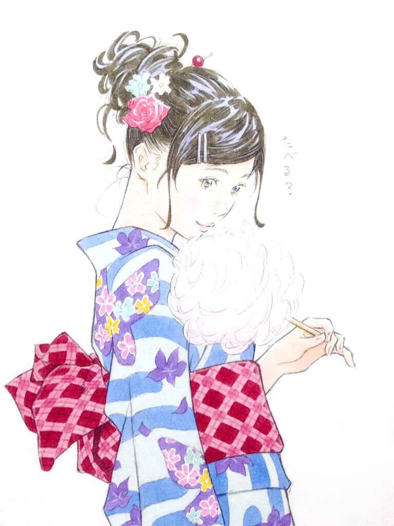
BV25 and T-4 are great for expressing the natural black hair of Japanese people. Also I often use E71 when coloring the dyed-brown hair of young girls. I like a little pale color like RV52 and RV63 - For me, these colors are easy to use.
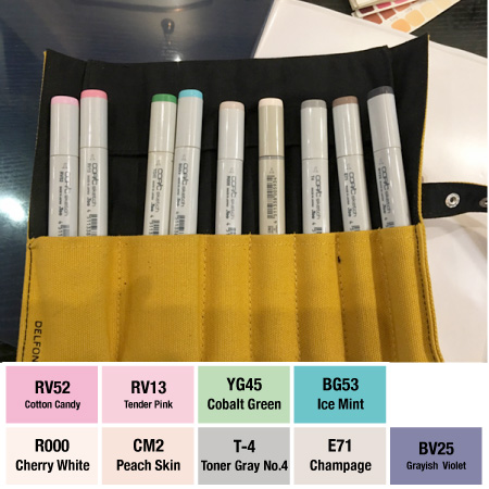
— Why do you use R000 and CM2* for flesh colors instead of E color family?
Actually I have tried E color family, but I felt the balance with other colors was not very good. I'm using pencils to draw the lines and I think the combination with E colors makes the color of skin a bit dull. I'd rather use the R family because its slightly reddish colors provide a feeling of transparency.
Sometime I use the light colors like BV0000 as the base color. As a matter of fact, the color of skin is determined by the color of the lighting at that time, so I'm choosing the most appropriate color as the situation demands.
(*CM2: The color from discontinued "Comic Marker")
— Why did you choose gray from the T color family, despite there are other choices such as C, N and W grays?
I know the W grays are popular, but I'm not a big fan of them. The T grays bring a certain level of reality to my work as time goes along and that's what I like about it.
About "Illustration"
— Please tell me if there's something you're using as a reference for your work.
Sometimes I check the magazines to get the ideas for poses and clothes of a character in my illustration, but I never trace the image as it is. I'm always adding my own individual interpretation.
Also I often exaggerate the pose of a character to convey the situation properly as much as possible. Even if it looks unrealistic, that kind of adjustment is necessary sometimes!
— It seems you're not using the techniques like color blending or gradation.
I want to make my illustrations realistic basically, but if I add shadows using many colors, it will end up too realistic like a photograph.
I'm trying to maintain a distinctive mood that only "illustration" has. So I prefer to give a three-dimensional appearance to my work by just adding the highlights - not adding shadows.
— Some of your illustrations have very detailed background. On the other hand, many of your works have only character is portrayed, no background.
It would be great if people are inspired by my work and make their own story of characters in a illustration, or imagine something may exist outside of frame. I don’t want to limit that possibility. That’s why I don’t give extra importance to the background so much. If too much information is contained in artwork, it becomes closer to a genre of manga, not illustration.
I care more about dynamics of lines. By softening up a contour of character partially, I can have a clear focus on the part that I really want to show.
About tools
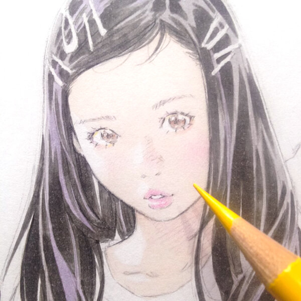
— You're drawing the line only with pencil or mechanical pencil and don't use the ink at all. I think that's what makes your works unique.
Pencil can provide a soft feeling - and that's what I need. And yes, I rarely do the inking.
A lot of people are telling me the pencil lines will bleed when they apply Copic. Actually, that kind of issue will be avoided in many cases if they choose hard pencils like F grade and draw the lines lightly.
— How do you choose the paper? Any standards?
I tried many kinds of paper from high-grade one to cheap one, but I ended up with normal copier paper after all.
One of the things important for me when choosing the paper is texture. Color is not an important factor compared to texture. The paper with slightly rough surface suits my taste. You must pick the right paper appropriate for your works.
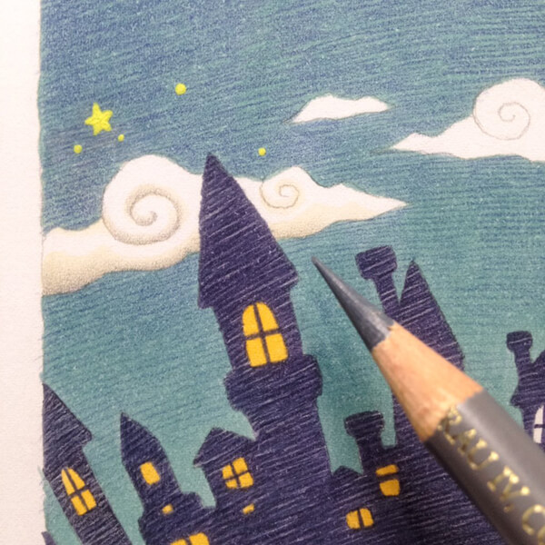
— I heard you have a ton of oil colored pencils. Could you tell me the tips when using together with Copic?
I use colored pencils when I have to do a subtle expression, like applying makeup on the girl's face or adding the highlights.
Also colored pencils are very helpful for hiding color unevenness. I used to think white of colored pencil is the most worthless thing in the world, but now white is my favorite!
When a color unevenness is occurred, I'd apply white pencil lightly, then overlay the different color to make it less noticeable. It's a very effective method, but very time consuming
— Is there a good way to prevent color unevenness?
Color 'em quick! That says it all. It's important to decide what area you're going to apply the color on ahead. Do not try to color a large area at a time. The color unevenness will be occurred if you interrupt the coloring in the middle of process.
Message from Mr. Kubonouchi:
I want you to recognize that there's more than one answer in the art field. You stumble because you cling to just one idea, like "Oh, I have to use pens to draw the line" - but there ain't no rules like that. I hope you use the "think-outside-the-box" sensibility when you create your own artwork.