- Category:
- All
- Design
- Illustration
- Manga
- Craft
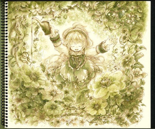
きぃか
Ms. kixika is a graduate of Aichi Prefectural University of Fine Arts and Music.
Her love for nature is inherent - So the stones or plants naturally became the main subjects of her artwork. With her superb Copic technique, the beauty of these objects is vividly recreated. We interviewed kixika san about engagement with Copic.
I graduated the university with a help from E81!
— When did you first start using Copic markers?
When I was in junior high, I bought my first Copic as the next step of colored pencils. I picked 12 primary colors, in the image of a typical colored pencil set - That was a terrible idea and my first attempt to be a master of Copic was ended up in failure.
— How did you overcame that setback?
My friends taught me how to choose the color, also I learned a lot from the video tutorials that wonderful illustrator Ms. Yasaiko Midorihana has released on her own website. Then I gradually increased the lighter shades in my collection and that allowed me to use Copic to obtain the desired effect. Also she has published the beautiful Copic instruction book recently (/en/book/graphicsha_3/).
— What have been your favorite color?
I love E81-89 color blending group released when I was working on senior project. Especially, E81 is the color exactly I needed and it comes in handy when coloring my "stones" project. I had to make the similar color by mixing YG91 and some W colors but E81 has enabled me to skip this process. So thanks to E81, I can say I was able to graduate the university. I'm really thankful for this color.
Broad nib provides the greater freedom to adjust the color
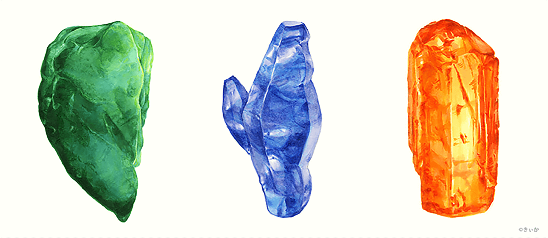
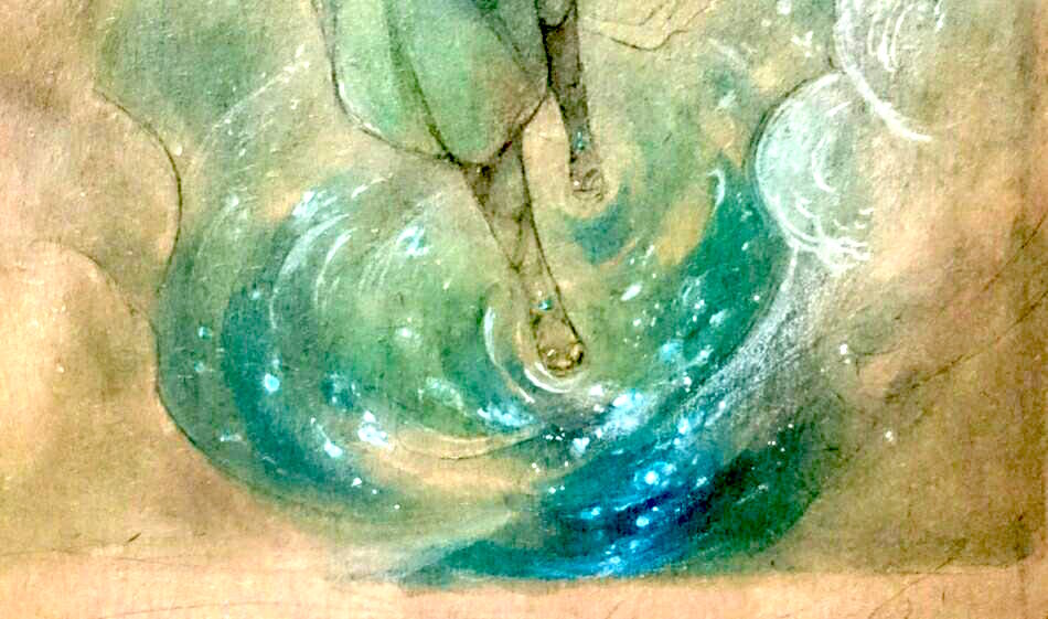
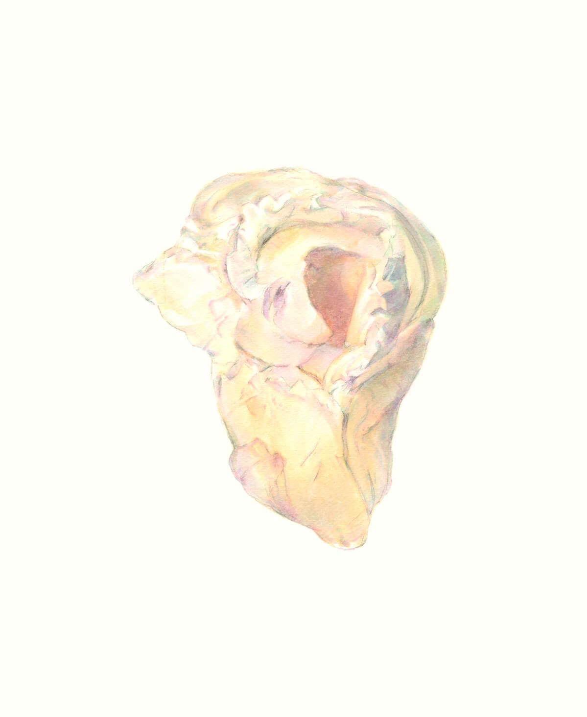
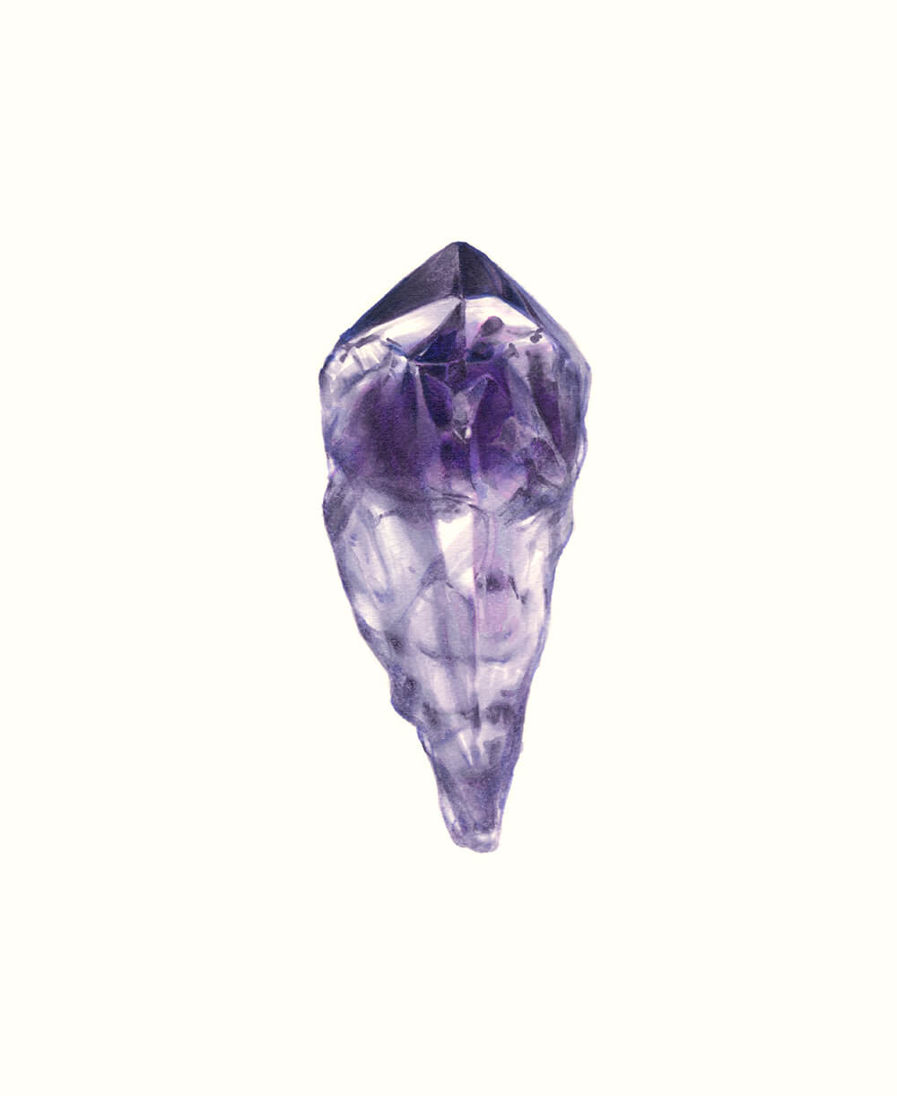
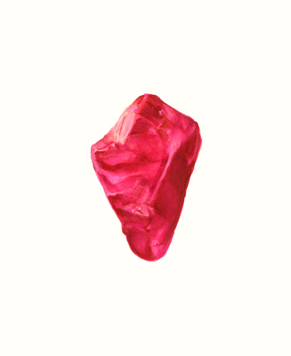
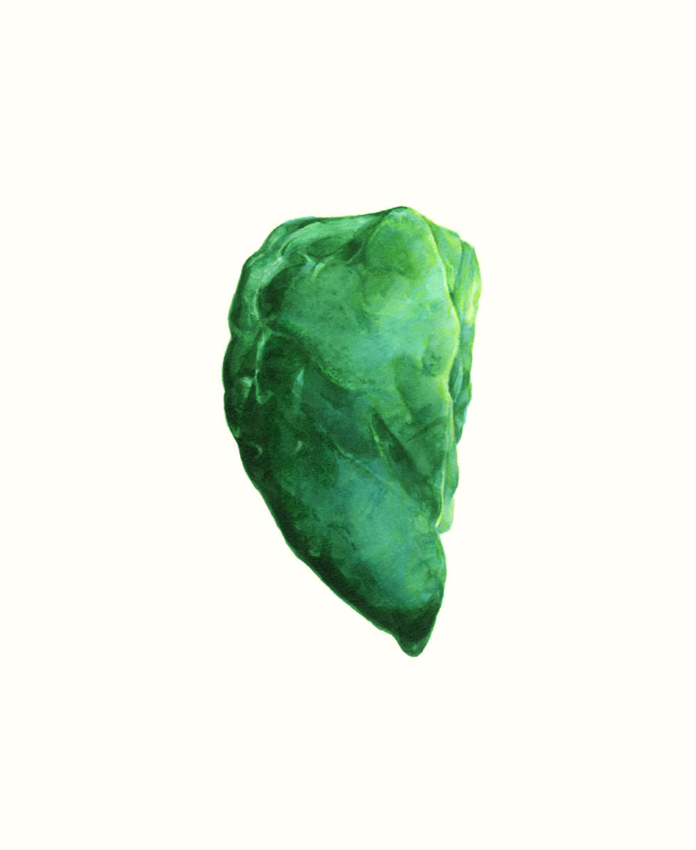
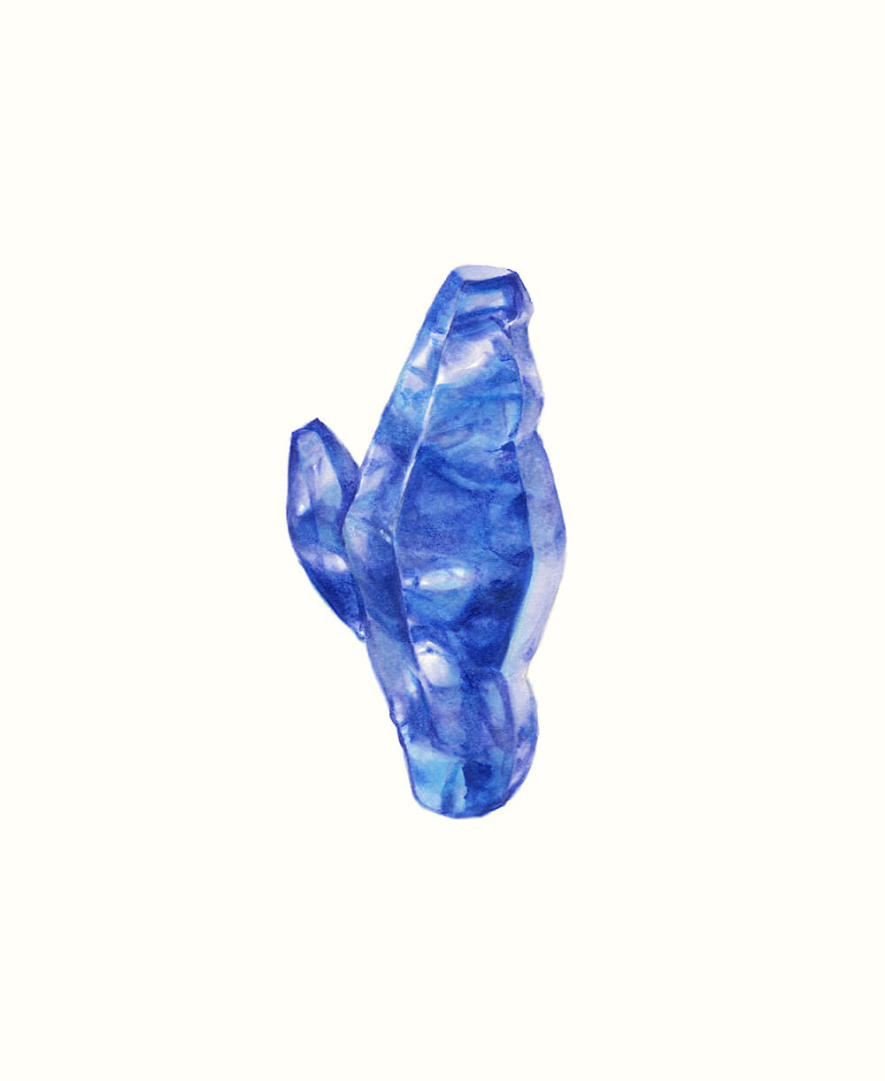
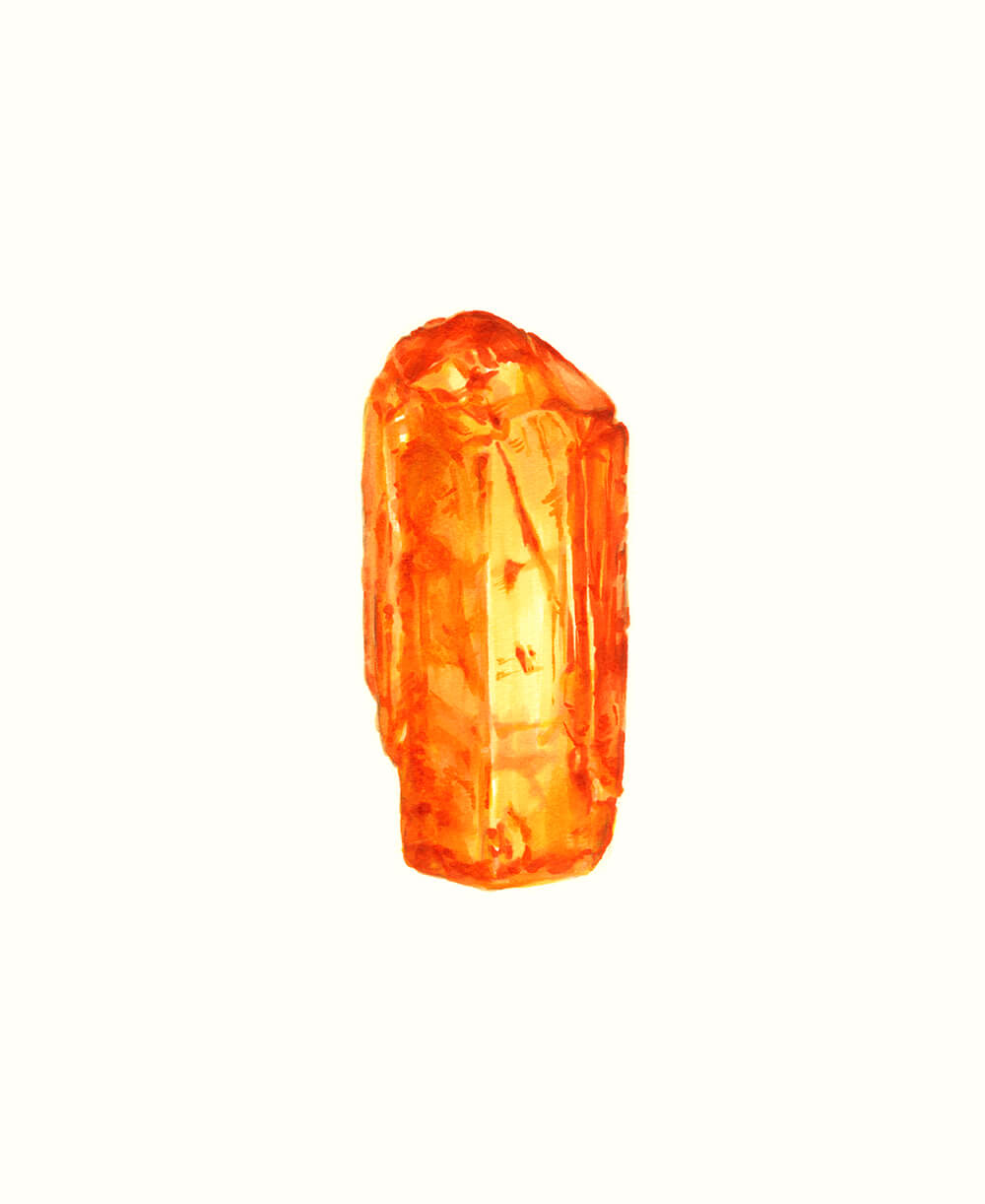
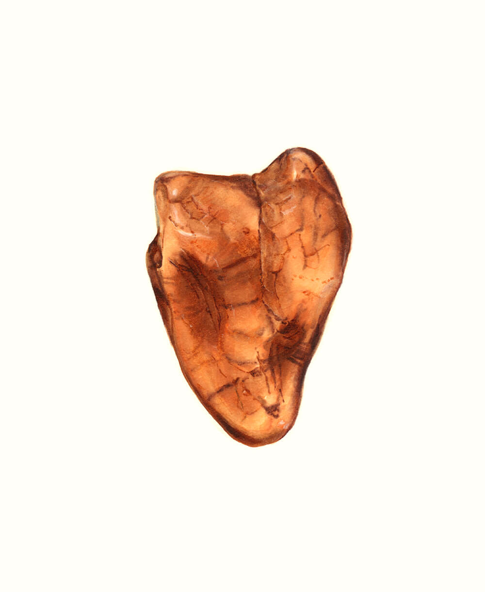
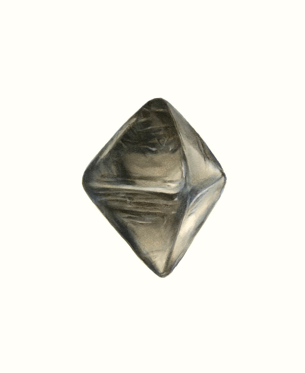
— During your whole career, "minerals" or "stones" has been the main subject of your artwork. How do you draw and color those stones? Could you tell me in detail if there's specific method?
Usually I would have an actual stone in my hands and take a look at it very carefully. The height of most of the stones is about 2cm, but some of them are granular stones. As for coloring the diamond, I don't have the sample so I had to refer to the visual dictionary and my own sketch. Coloring the stones with 6 colors was pretty challenging for me.
I sought an effective way and finally I decided to apply these 6 colors to the color family, intensity value and luminosity value of each particular part of stone. In other words, I specified Copic color numbers for the color of each and every part of stone. This process made me easily grasp the appropriate color.
— In the process of creating your project, which parts require extra attention?
I really care about the type of nib, paper and the material used in combination with Copic. First of all, using Broad nib is the key. Honestly I used to think Broad nib is not serve any purpose, but one day I found Broad nib could provide the greater freedom to adjust the color than Super Brush nib.
Super Brush provides a greater density of color, but the color would be penetrated through the paper too fast. Since then, I've been using Broad nib for "stones" project mainly.
— What type of paper do you like best?
I like Japanese watercolor paper called "Mat-Thunders". This thick paper is good for both feathering and sharper expression, also the highlights can be added with Colorless Blender without difficulty. On this paper, the color would be penetrated at an adequate speed. That's another reason I like this paper.
— Is there any other tools you are using along with Copic?
I'm using white ballpoint pen for highlights. I use the cotton bud to diminish the highlights a bit when it became too conspicuous. Cotton bud is pretty useful for expressing very subtle highlights!
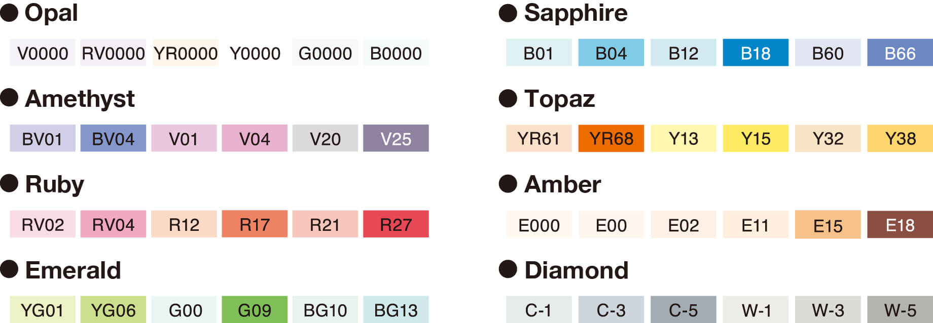
Coloring "stones" with 6 selected colors
— We carefully selected 6 colors each for coloring 8 different types of "stone". Total 48 colors have been chosen for covering the wide range of color phases these "stones" have.
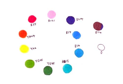
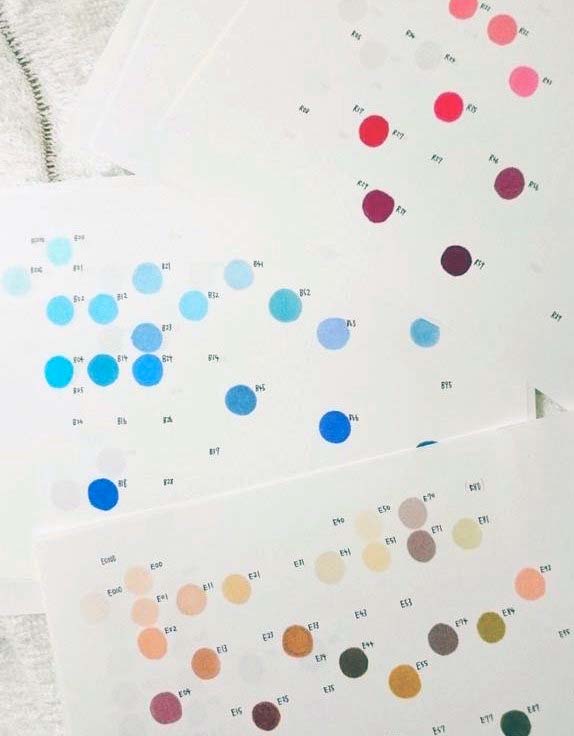
— Copic adopts an unique “Copic Color System” to manage the colors two-dimensionally and intuitively. We've heard you're using your original color chart which have been made based on that system.
That's correct. I divided every color families by each different piece of paper, then laid out the blending group and intensity value of each one of color into vertical and horizontal axis. With these charts, I'm able to understand the relative position of each color from a variety of different angles. Also I can compare the other color family simply by layering the paper.
— Does your color chart help you to understand the grounds of these 6 colors combinations selected for coloring the "stones"?
With this chart, I was able to understand connections between each color and realized how these 6 color sets are carefully designed. It's really amazing.
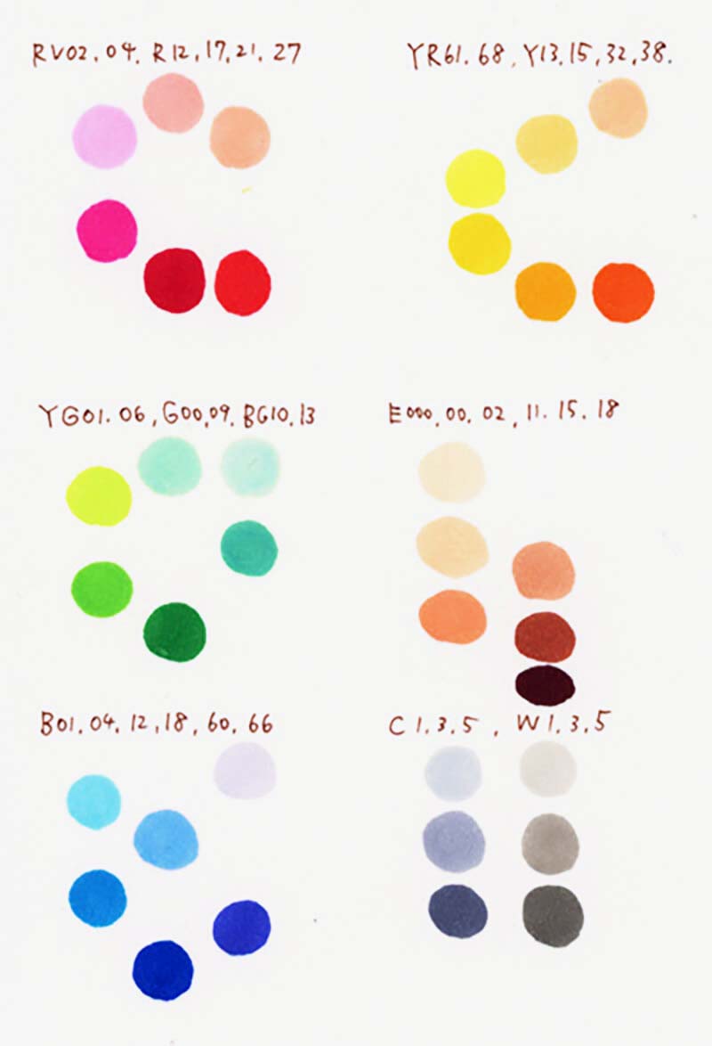
— Except "Opal", "Amber" and "Diamond", each 6 colors combination contains 3 paired light-dark colors. We're glad you accurately understood the core intent of the sets!
What is very interesting for me is that the low-chroma color is assigned as the brightest color in the set of "Ruby", "Topaz", "Emerald", "Sapphire" and "Amethyst". With this, I can express with the lower saturation colors while I'm increasing the brightness of high-chroma colors. I actually enjoyed the limitation of colors these sets offered and made many discoveries during the process.
I would like as many Copic users as possible to experience these special color combinations.
Stones:
— Illustrations for 9 different types of "stone".

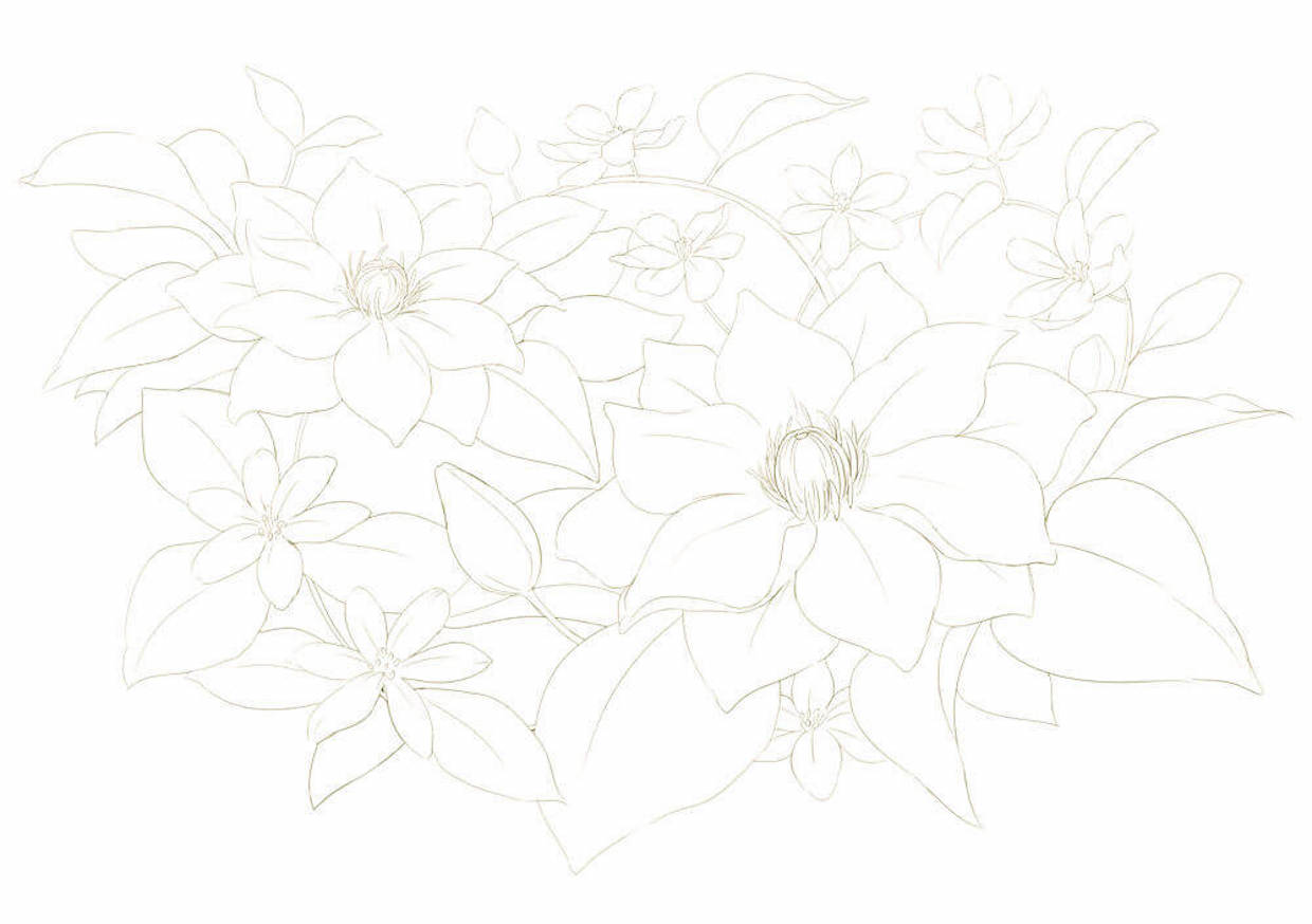
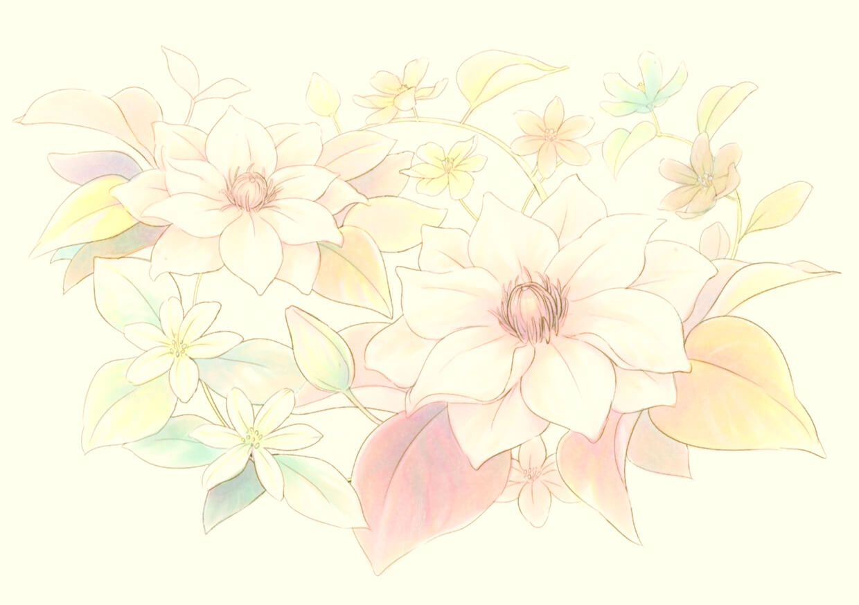
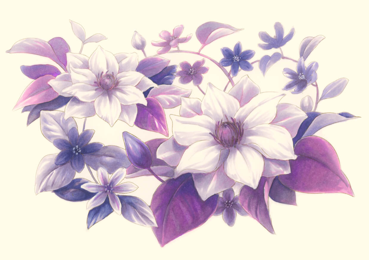
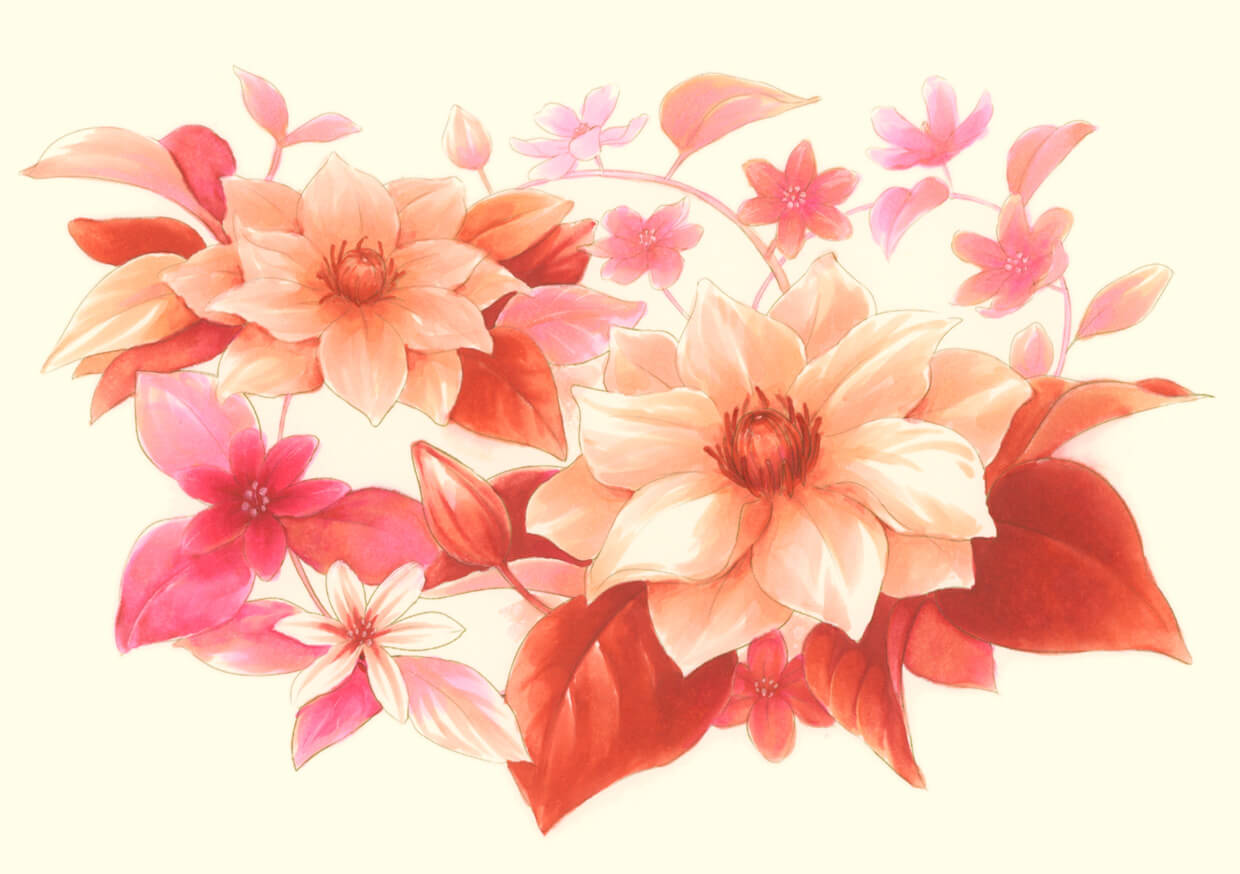
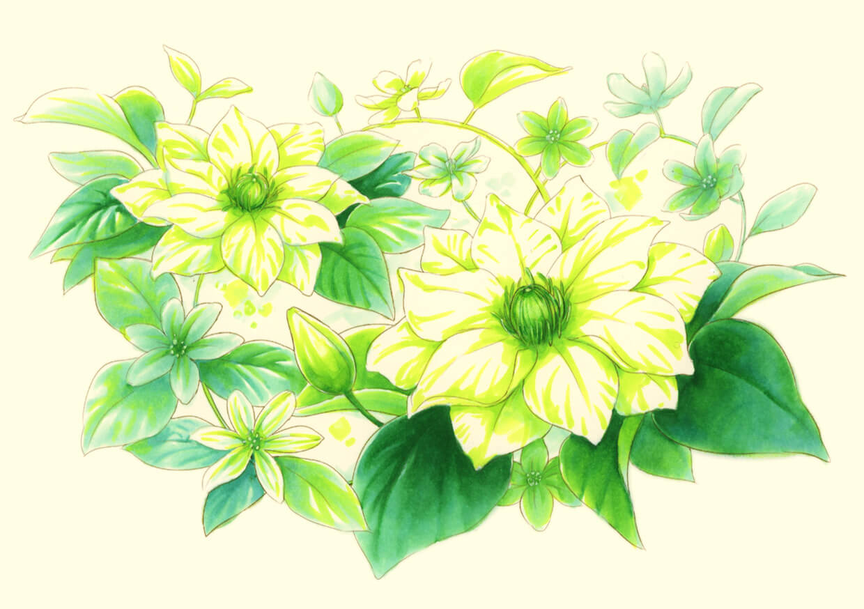
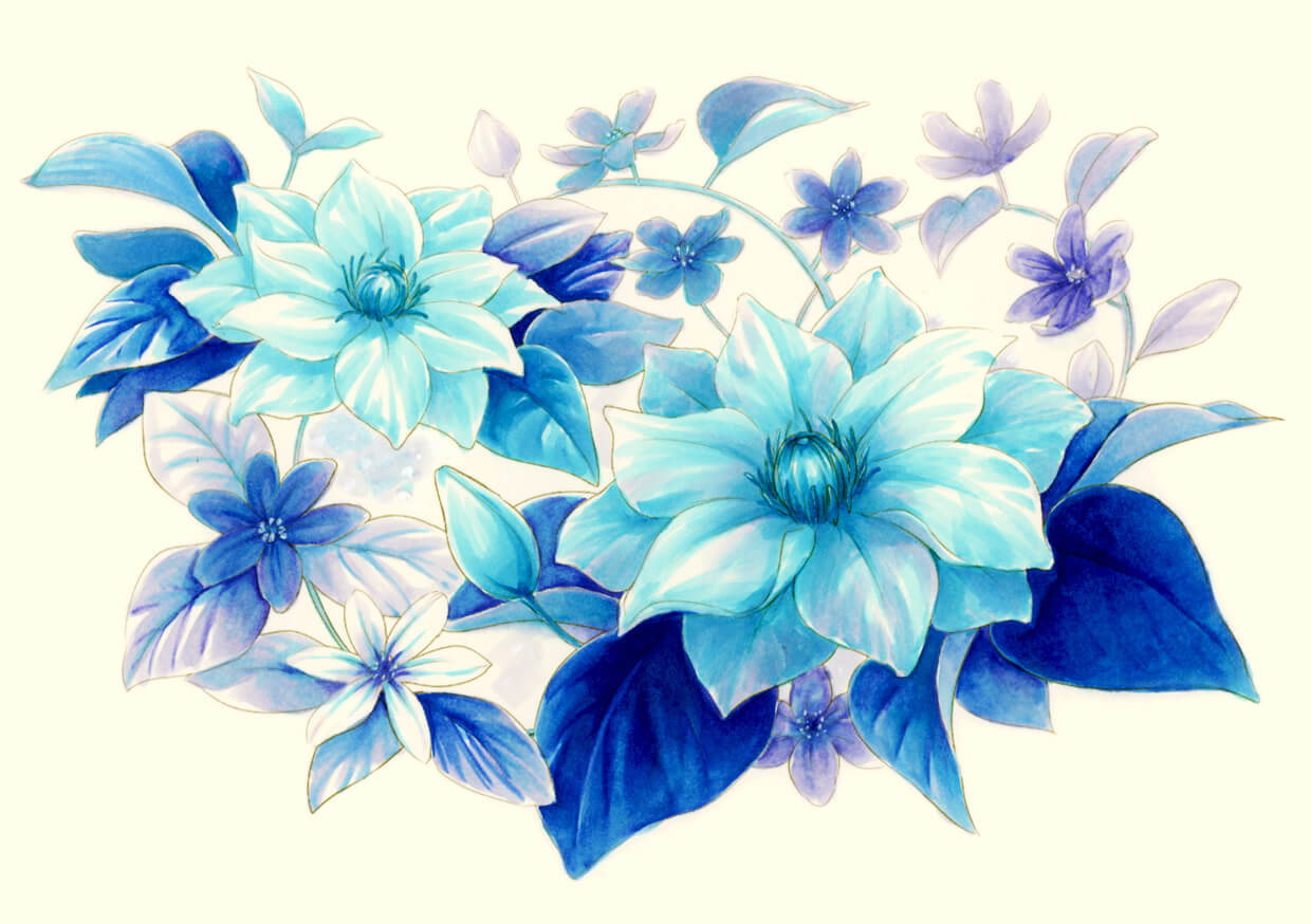
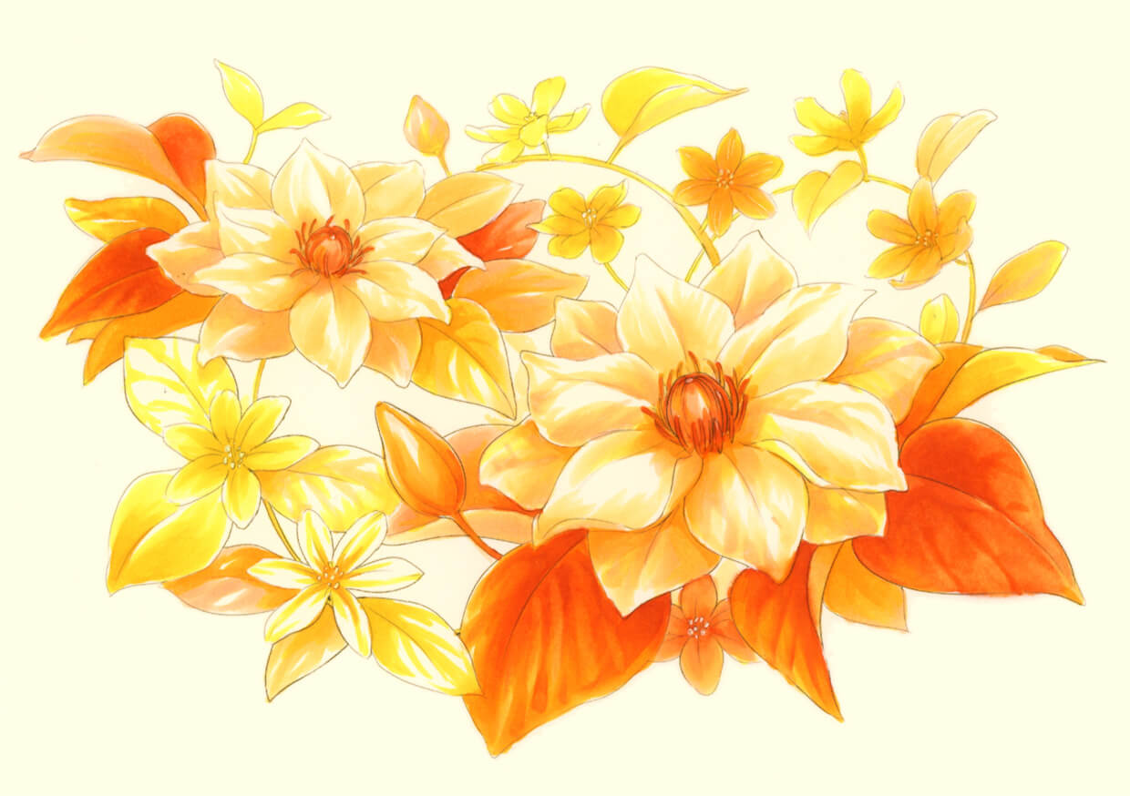
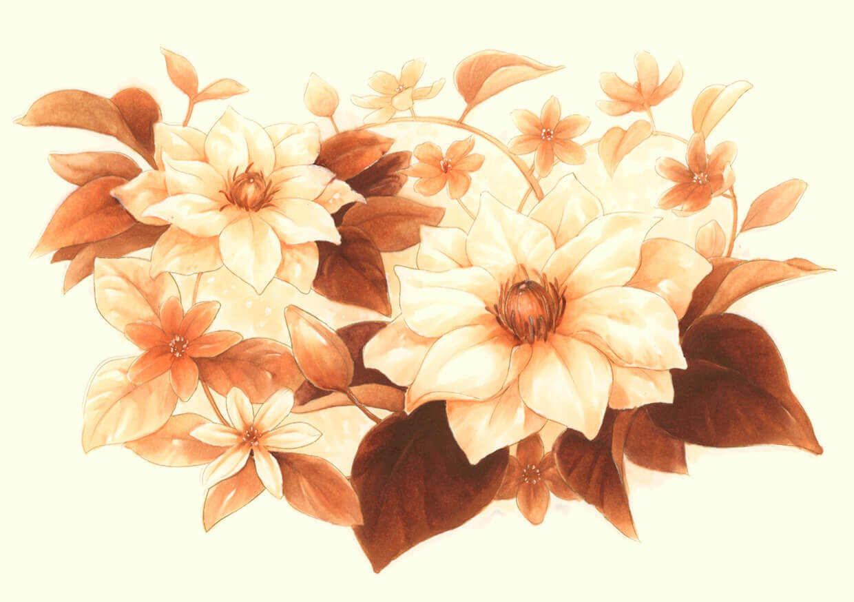
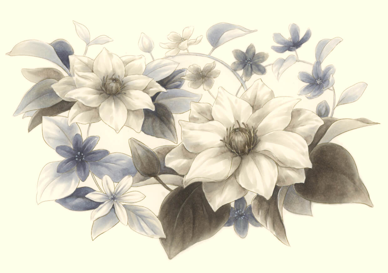
Plants:
— Colored the same line art of plant with 8 different sets.