- Category:
- All
- Design
- Illustration
- Manga
- Craft

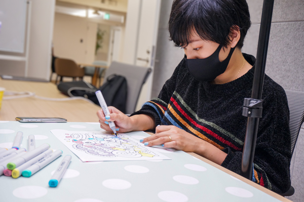
Sekiya Yurie
llustrator. She graduated from Tama University with a degree in Graphic Design in 2010. She is known for using big sparkling eyes in characters. She mainly draws small animals and girls using both digital and analog media. She is very known in the apparel industry and for her character design. These days she is busy developing her “Pero Pero★Sparkles” character.
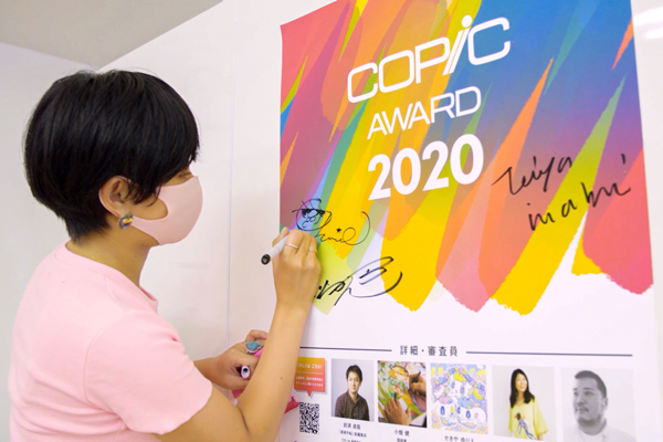
She was one of the judges for “COPIC AWARD 2020”. We had the occasion to interview her today and received a special line art from her. The line art is free to download on our site.
—It seems that you were using Copic markers before. Can you tell us about how you learned about Copic?
When I was in 3rd grade, I was drawing with my friends. The best drawing in my class was from a student who used Copic markers. That got me interested in trying them out.
—What are your favorite Copic colors?
I love vivid and clear colors such as BV02, BV11, RV06, RV13, RV25, B04, B12, B23, BG23, BV02, Y04, Y17, YG06.
—Can you tell us about the steps you took until you debuted as an illustrator?
When I was studying design at Tama university, design lessons were provided from select graduated students such as “Tare Panda” and illustrator Hikaru Suemasa. When graduation got closer, I got a direct invitation to work with her. I had a wide range of duties, from delivering pieces to customers to character design and goods when I was working there after graduation.
After that, when mobile games started to become popular, I moved to a smartphone game company. I worked there for 3 years while working as a freelance character designer. My main jobs at the company were design management and coordinating designers. Beside management, I worked on making gif images for anime greetings.
—Is there any artist or authors that influenced you?
When I was a child, I loved reading the “Ribbon” manga magazine. From reading Ribbon, I got influenced by Arina Tanemura in particular. I also bought the “Horror M” magazine every month when I was an elementary school kid. Thanks to that magazine I started liking scary and gross things.
Besides that, I loved 80s US toy characters such as “My Little Pony” and “Popples”.
—Can you tell us when you use analog or digital drawings? What kind of image do have when drawing?
I use analog drawings when I have exhibitions, and I use digital for drawings aimed for prints and goods. The drawing that I use for work are almost all digital.
I always take great care on the color mixes, the strokes, and the pressure on analog drawings. On digital drawings I use simple flat colors, but I always try to use the brightest colors as possible.
—What is the most important thing when you take on an art commission?
I’m always thinking about “Why did they commission this job to me?” or “what do they want me to achieve?”. I think there are two types of art commission: first, make you draw freely with your style; second, draw something based on the commissioner’s image. In my case almost everyone tells me to “do it my way”. I always take in consideration the age and the final target, where is my work going to be sold and the image or the choice of color the commissioner asked me to use when I make an illustration. The most important thing is to “deeply understand” the commission substance. When I worked on making goods for a teen idol group before, the first thing I did was to know each member of the group. I looked for each member’s signature color, habits, and hairstyle and then I though how I can draw them as cute as possible. Also, when I was drawing, I focused on “what the fans found cute about them?” or “what kind of gestures are cute for the fans?”.
Besides this, I try to reply to e-mails as fast as possible (laughs)
—We heard that you hold special lessons aimed at students. What kind of things are you teaching?
I sometimes hold special lessons for students that are interested to make illustrations for work when I receive an inquiry from colleges. A lot of students simply want to know “why is it possible to draw for a living?” so I usually present my profile and my work contents during these lessons. After the lesson a lot of students show me their artworks and I always advise them about where their design/style would fit in the industry. Beside that I always give advice on how to make an artwork that “catch the eyes”. For example, the artworks that made it to the finals in the “Copic award 2020” competition were all artworks that made an impact on your eyes.
Sometimes there is this drawing that looks good, but when you see it from various point of views, it makes you think of things such as “where should I see?” or “if they just did a close here…” or “if they just used a more saturated color there…”.
I think that the most important thing is to make an artwork that you can firmly say is “complete”.
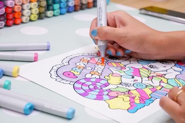
—Thank you so much for making a new special line art for this occasion. What kind of image did you have when you were making it?
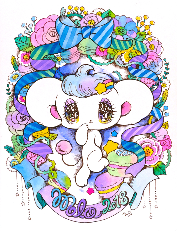
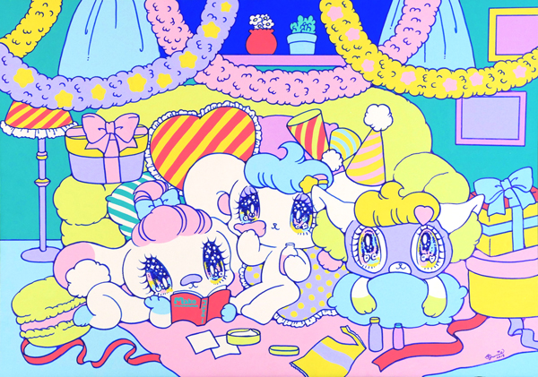
I tried to make it a simple drawing with lots of parts to color. I used my original character “Pero Pero★Sparkles” and I designed the sweet to make them cute regardless of the colors used. You can enjoy coloring it with Copic markers alone or with you family and friends!