- Category:
- All
- Design
- Illustration
- Manga
- Craft
Grangel Studio
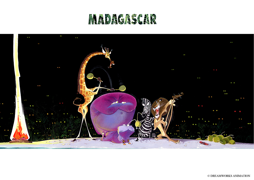
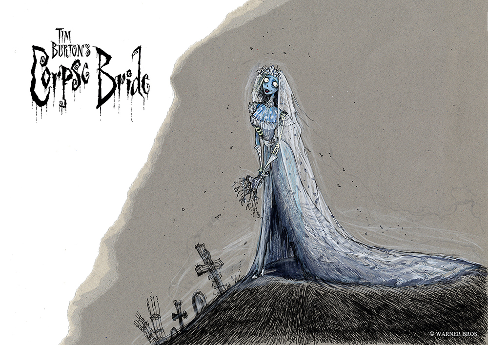
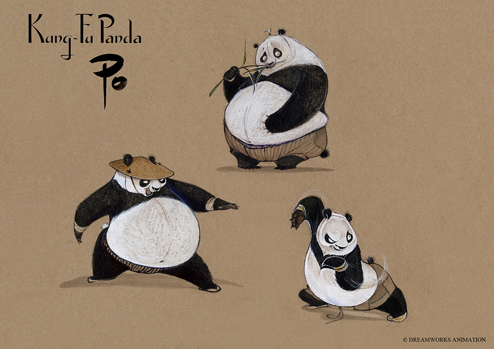
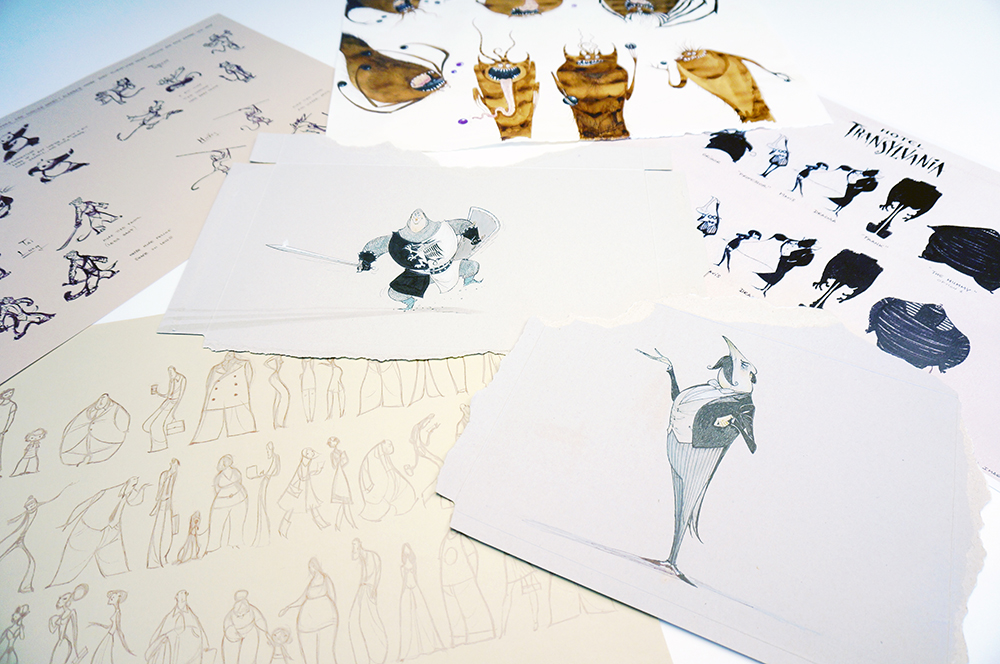
Jordi and Carlos Grangel are Artists and Grangel Studio Directors, a studio based in Barcelona that specializes in character design focusing on animation feature films. Over the past 25 years, Grangel Studio has created art styles and collaborated on more than 25 feature films, including "The Prince of Egypt" (DreamWorks 1998), "Madagascar" (DreamWorks 2005), "Tim Burton´s Corpse Bride" (Warner Bros. 2005), "Kung Fu Panda" (DreamWorks 2008), "How to train your Dragon" (DreamWorks 2010), and "Hotel Transylvania" (Sony Animation 2012).
Instagram/Website/YouTube
Could you introduce yourselves to those unfamiliar with your work?
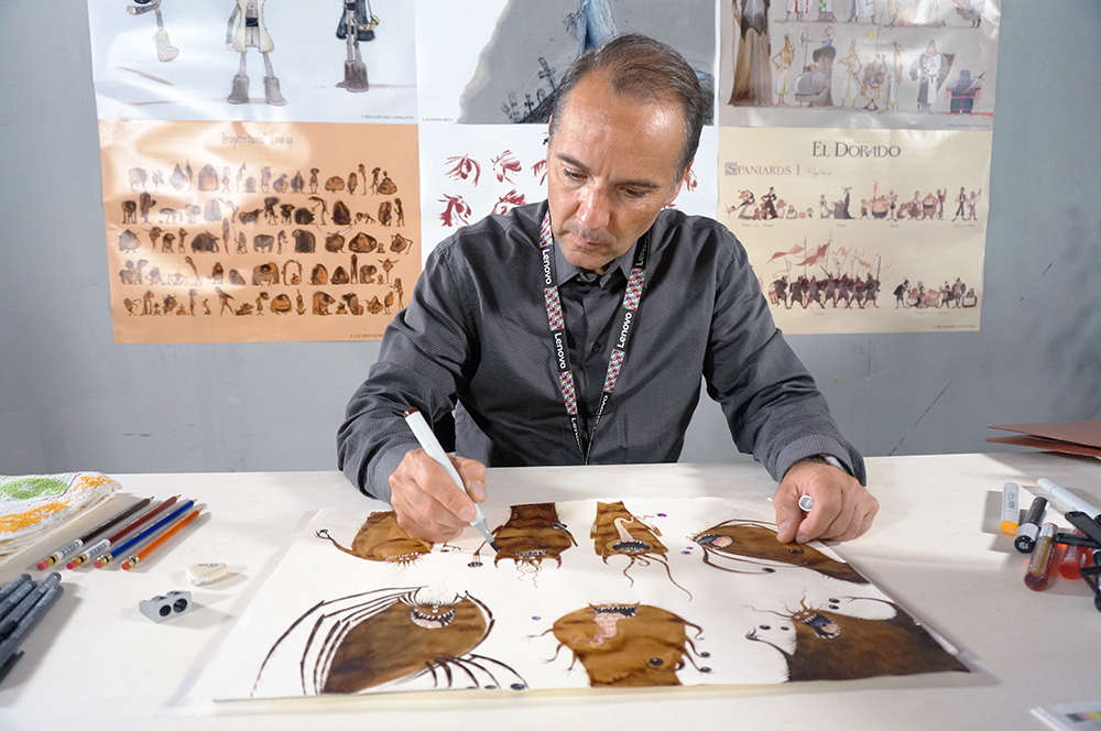
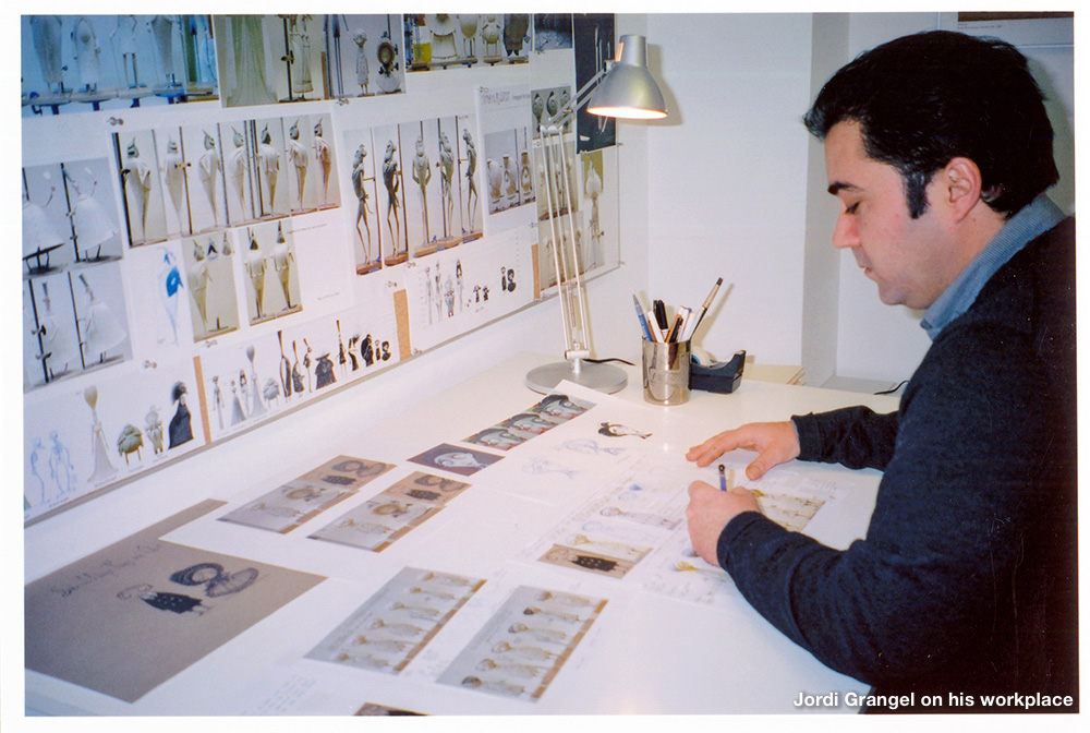
We define ourselves as artists or designers: we established a studio in 1985 in Barcelona, specializing in creating the movie art direction in the pre-production development stage for high-quality animation movies.
We dedicated ourselves to creating illustrations and comics or rendering some work for publicity in the first five years of the studio. From 1990 and on, we focused on animation. We worked on more than 25 feature films until now, such as Balto, The Prince of Egypt, The Road to El Dorado, Spirit, Sinbad, Madagascar, Kung-Fu Panda, Corpse Bride, How to Train your Dragon, Hotel Transylvania, and Ron’s Gone Wrong to name a few.
If you are interested in the complete movie list and other works, please visit the Grangel studio official page here
What inspired you guys to start creating illustrations? What is your artistic background?
We always had the passion and the drive to create illustrations and characters. We liked many comics and animation and studied animation and art techniques. After that, we developed our way of doing things. Our three essentials are Passion, Imagination, and Discipline.
Grangel Studio is a laboratory of styles -- we like to create the best possible look for the films we work in and make characters that suit the story best.
Who and what inspires you guys?
Our primary sources of inspiration are nature and art from any culture, past and present.
Nature is always a fantastic source for getting inspired. We worked on many feature films involving wildlife; closely observing nature was one of the keys to resolving many problems and making elegant, stylized figures and shapes.
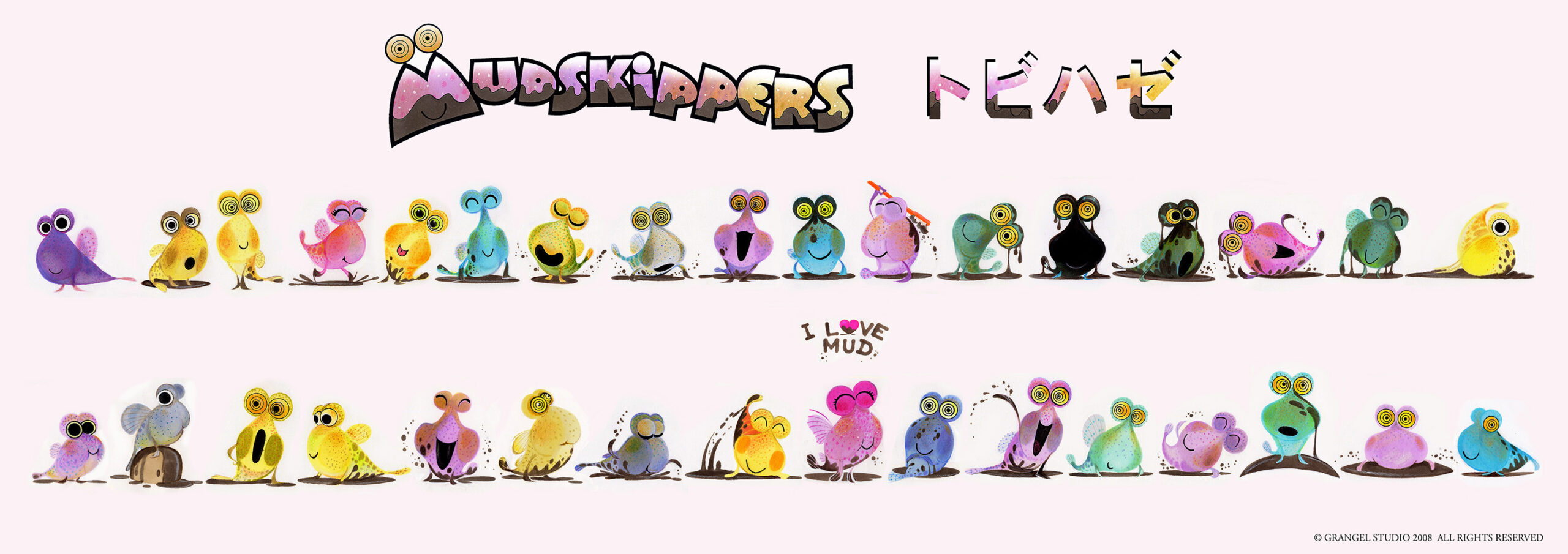
Could you tell us about the characters for Mudskippers that you provided exclusively for Copic? (How were these characters created, etc.)
We wanted to create a line of characters, a friendly family of creatures.
We went with Mudskippers because we found that it had many graphics and visual possibilities bringing out the full potential of the entire color chart of Copic markers. Every character was created with the thought of having a different color and being unique, like each Copic tone. Each character has a dominant color but also has different shades.
We used an average of 4-6 colors on each character when they are clean from mud using the entire Copic chart. Ultimately, we wanted to donate all our Mudskippers line designs to Copic to inspire artists worldwide, and for any needs or ideas, Copic would like to do with those designs.
When did you first start using Copic markers, and why did you choose them in particular?
The studio started using Copic markers long ago, around 1993, as far as I can remember! We started coloring our characters for the presentations of feature films, and the directors and producers loved the final look. The colors were subtle and beautiful, and we found them easy to use with a great range of colors.
As Copic widened their selection, we could have more possibilities in choosing the right color for each character. For example, Copic is fantastic for human color skin tones. We found it better than any other brand, and it helps us to color our human characters. That is just one example; Copic also has a great variety of Greens, Yellows, Blues, and Browns, as those colors help our background designs.
Copic makes quality products, and we are trying to do the same, so it is a perfect match for us.
What are your favorite Copic colors and why?
We have many favorite colors. It is challenging to name just a few, but when we do tones or shadows in grayscale, we love to use Cool and Warm Grays. We also love the Natural Gray line for adding some volume to the white part of the eyes of our characters, using N1.
We also love the following colors: E18 Copper, E29 Burnt Umber, E81 Ivory, YG11 Mignonette, R00 Pinkish white, YR01 Peach Puff, B97 Night Blue, B99 Agate, G99 Olive, RV000 Pale Purple.
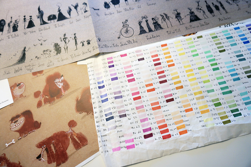
Could you share any tips and techniques for using Copic?
Of course! We have a few tips to share; we like to start by using a lighter color first and doing passes on top with darker tones. We use an average of 4-7 color layers on all our characters, meaning we use 4-7 colors at a minimum per character.
For the skin, we use 4 layers with 4 different colors that help to add volume and make our characters more alive. When we color costumes, we use the same process, using between 4-7 colors for each piece.
We use Copic ink with sponges or Copic Wide markers for backgrounds like the sky or wider spots like grass or jungle green areas. We also use between 3-4 different types of blues for each sky we produce, depending on the kind of environment we want to illustrate.
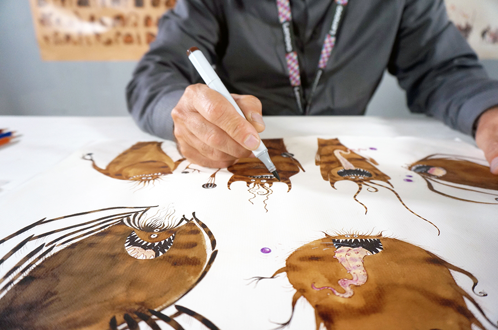
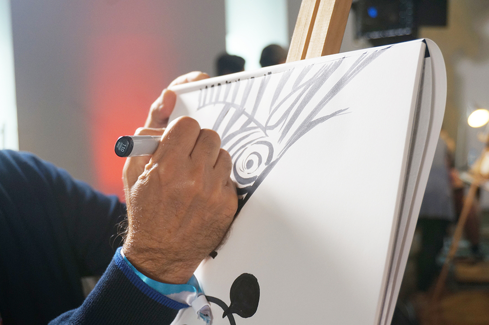
We love the Copic Multiliner pens for sketching, as they are perfect for doing the outline of the character. Grays are also perfect for coloring the shadows of characters. We use C2 Cool Gray or W2 Warm Gray. For the black pupils of our characters, we use the Copic Black Multiliners, 0.03, 0.2, and 0.5
Could you tell us about your dreams and artistic goals?
We enjoy what we do and look forward to working with new artists worldwide from diverse cultures. We look forward to having more experiences and producing more of our creations like the Mudskippers. We also enjoy teaching and passing our experiences and legacy to the new generations interested in learning animation.
Would you tell us about your new projects (books, events, or exhibitions)?
We are currently creating the designs for the characters in three different feature films. We are working on one stop motion, one 2D classic traditional animation, and one 3D CGI.
This year is also the screening of Pinocchio, by Guillermo del Toro, where we collaborated on creating Pinocchio and Geppetto. Apart from that, we have a few personal projects, but compared to current productions, those move at a much slower pace.
We are planning a few exhibits of our work in Italy and Spain. Hopefully, one day we can do one in Japan, a country we have visited and love.
Any last messages or advice you would like to share with the Copic community?
Be creative, do things with your hands, and get your fingers dirty if necessary. Enjoy your Passion!
