- Category:
- All
- Design
- Illustration
- Manga
- Craft
I'd grab Copic when I come up with an idea
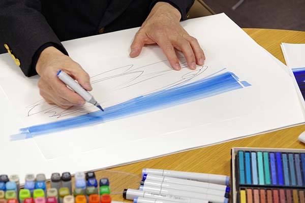
— When did you first start using Copic markers? What inspired you to take up Copic?
I began using the marker from Speedry Marker*, a predecessor of Copic. Before that, I was using poster paint by adjusting the color into five gradations but it's water-based and took too much time to dry. Copic improved efficiency of my work dramatically since it has an organized color number system and fast-drying ink is used. You never know when your best idea will strike. By drawing the ideas as soon as it comes up, I can get them out of my head and document each and every one of the important thoughts.
* Back in 1969, the domestic production of Speedry Marker has started. It was the first marker pen specifically developed for designers.— Is there any specific colors you routinely use?
I love to use B23 or B32 because I know how to handle these colors properly. For these colors I can estimate how they work when I blend a certain amount, and they naturally became my favorites. Unlike accessories or clothes, what I'm designing are not affected by general trends. So I don't use vivid, strong colors and inevitably choose the modest colors such as Beige or Cool Grays. If I need to use red, I would pick R35.
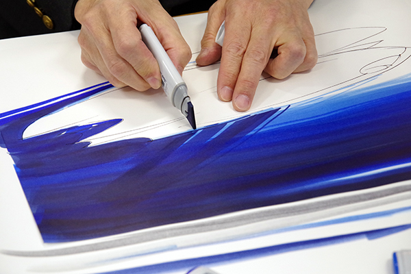
— Most designers are using Copic Classic for sketch and rendering, but you're using Copic Wide mainly.
In many cases I use the paper larger than A3 size so it takes too much time to apply the color with Copic Classic. This design sketch was mostly done with Copic Wide. Copic Wide is perfect for coloring the large area, but if I use the edge part of nib, I can draw the fine lines as well. I used Copic Classic in small parts, also some colored pencils and pastels were added to express the smoothness.
Logically explaining the meaning behind the shapes of things - That's the role of design.
— How do you draw design sketches? Could you tell me a bit specifically about it?
I would begin with the shadows which make the appearance of an object look three-dimensional, and work on the backgrounds while considering the reflected glares on the surface of an object. The reflection of light needs to be calculated so I purposely leave specific area remain white. In this design sketch, various different shades of blue have been layered over again and again to add the depth in color. This is a process of trial and error to find exactly what color I want. It's very important to precisely comprehend and express the shapes of object through the creating process like this.
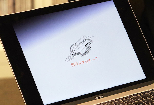
— Is there's something you're using as a reference for creating your project?
Usually my design comes from more than one idea. I saw an electron microscopic picture of scales of hammerhead shark the other day and noticed it looks just like a front cowling for Formula One car. I was surprised the shape is very rational and well-designed. The shapes found in nature inspires me alot. Sketches for design is required to be rational and logical so we must be ready to explain the meaning behind the shapes of things.
— Did you learn how to use the marker on your own?
Yes. There was senior colleagues using the markers but I think these guys didn't fully utilize them, actually. It was impossible to do other than teaching myself because there were no books or classes back then. In the 60's, all the magazine ads for automobile from the US had an illustration. Those were valuable source of information and I intently studied the drawing techniques used. From those ads I learned how to exaggerate the form, and the method expressing the reflecting surface or the wet road. Composition is the basic elements of design. Along with the magazine ads from the US, the exciting Ukiyo-e (Japanese woodblock prints) by Hokusai served as very helpful reference for learning about composition.
Artwork drawn in ink could carry a powerful messages
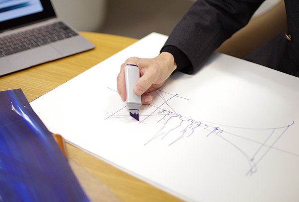
— Even in this digital age, I think showing a sketch capturing a supposed scene/situation is convenient and facilitates a communication at a business meeting.
At a meeting it's very important to convert the ideas into tangible forms (such as sketch) immediately. By giving options on a real-time basis, you can pound out the details of idea and share it with more concrete information. It doesn't matter if the tool is digital or analog, but speed is one significent advantage of hand-drawing.
Mr. Fukuda demonstrated the process of drawing the sketch for us. It was really amazing to see a visual picture in his head emerged on the paper without any hesitation. Even more amazingly, he drew this complex sketch from the opposite perspective!
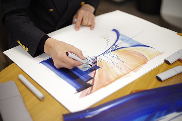
— Wow. It's so inspiring to see the idea just came up in your head is actually appearing before my very eyes.
When I draw this kind of sketch, I roughly organize the ideas with a sense of perspective drawing. What I basically do is adding the horizontal line, vertical line and radial lines then keep improvising. A sketch doesn't have to be perfect. You may able to draw a hundred of nice sketches with the help of digital tool, but this is communication. It's more important that everything I draw is clearly understood. I'd rather put a high priority on converting the ideas into visually apparent format in real time. Also you should never underestimate the power of ink. Artwork drawn in ink could carry a powerful messages. The vividness of colors, expressivity due to combination with tracing paper are emotionally compelling.
— 2017 is the year of Copic’s 30th anniversary. What is your message for Copic?
I hope you (TMP) rediscover more about the advantage of your products. Copic is a fine, unique artist's material - If I'm a salesperson, I could convey every single good point of Copic. It's not surprising Copic continues to be popular over many years because its functions (a variety of colors, clarity of ink and fast response) deserve a high valuation and have been loved by many people. I wish Copic will have many more successful years.
 The words from Mr. Fukuda:
I have the habit of keeping a record of the idea in a form of sketch while it's fresh in mind.
Above is the sketch of an imaginary floating travel device. This sketch drawn freehand is the evolvable version of my abstract idea in many years ago.
In general, marker pen is ideal for the flat representation, but the occurrence of color unevenness by layering or blending colors could be occurred. However if you use other materials like pastels or colored pencils together, that color unevenness will be turned into advantage when expressing various different textures such as stone, wood, metal, glass, cloth or leather.
Design sketch as a visual communication tool may be paraphrased as a "recording device of idea". At the same time, it's an artificial incubator which generates new creative ideas.
Copic extends our range of expression, and imagination.
■About Copic Wide:
 Copic Wide
 comes with a 3/4" (21mm) wide nib. This is the best choice for coloring large areas quickly.
“Wide Original (empty marker)” allows you to mix the colors or expand your maker collection with by using Various Ink (sold sepatately) to fill them up. Nib options are available.
Note: Stores dealing in Copic Wide is limited. Please contact the store near you for stock status.
Or visit:Tools web shop
Copic Wide
Copic Wide comes with a 3/4" (21mm) wide nib. This is the best choice for coloring large areas quickly.
“Wide Original (empty marker)” allows you to mix the colors or expand your maker collection with by using Various Ink (sold sepatately) to fill them up. Nib options are available.
Note: Stores dealing in Copic Wide is limited. Please contact the store near you for stock status.
Or visit:Tools web shop


