- Category:
- All
- Design
- Illustration
- Manga
- Craft
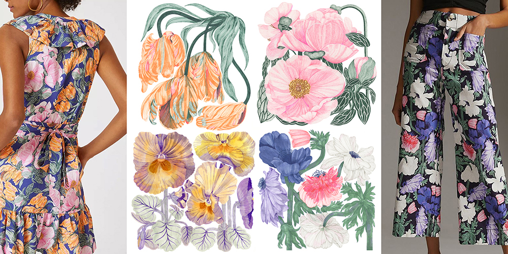
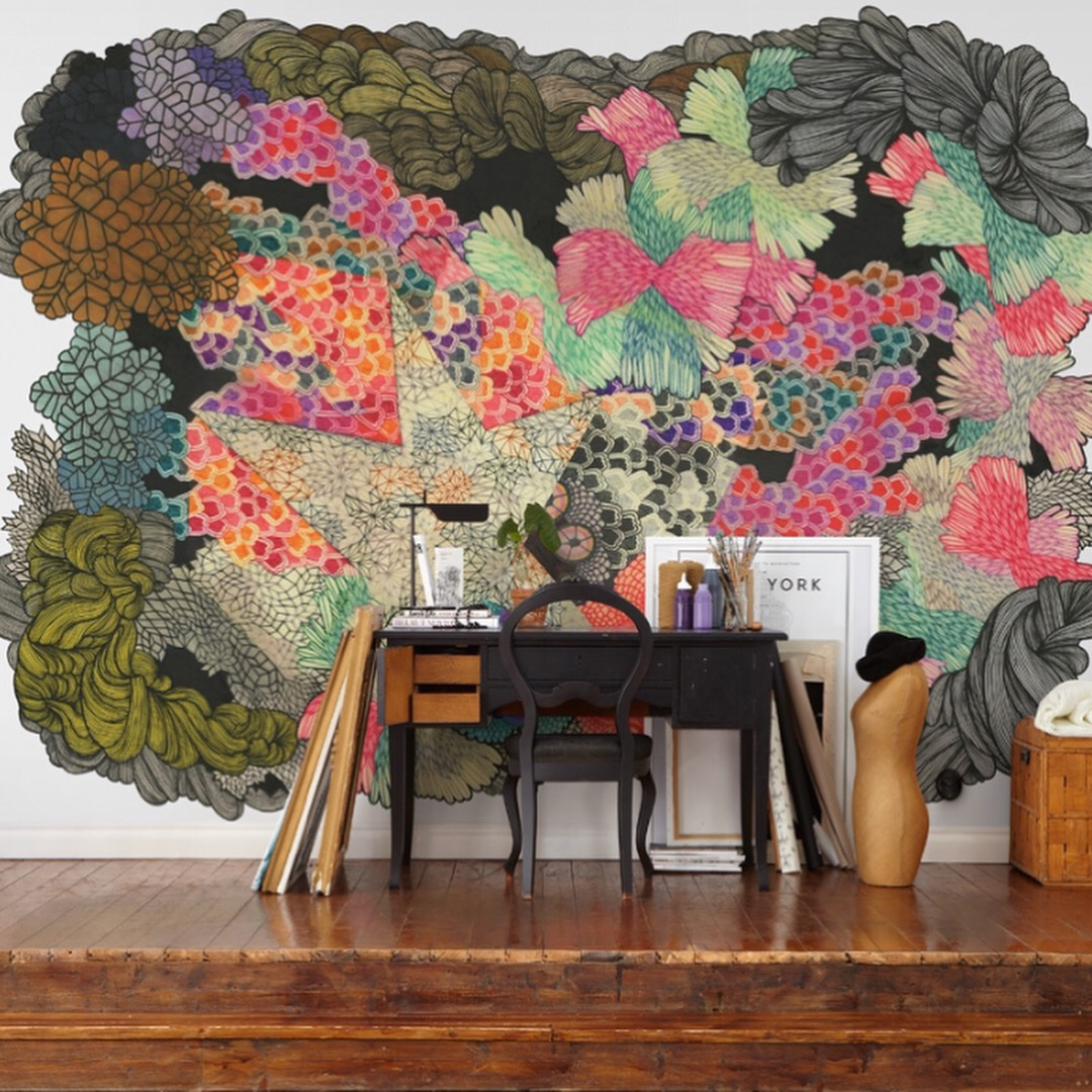
Cecilia Pettersson is a freelance designer/artist based in Gothenburg, Sweden. She has a master’s degree in design (graduated from HDK, Gothenburg University of Arts and Crafts in 2009). Cecilia specializes in prints and patterns, and her work often starts with a drawing or painting by hand.

How do you define yourself? A textile designer? An illustrator? A visual artist? Or all of the above?
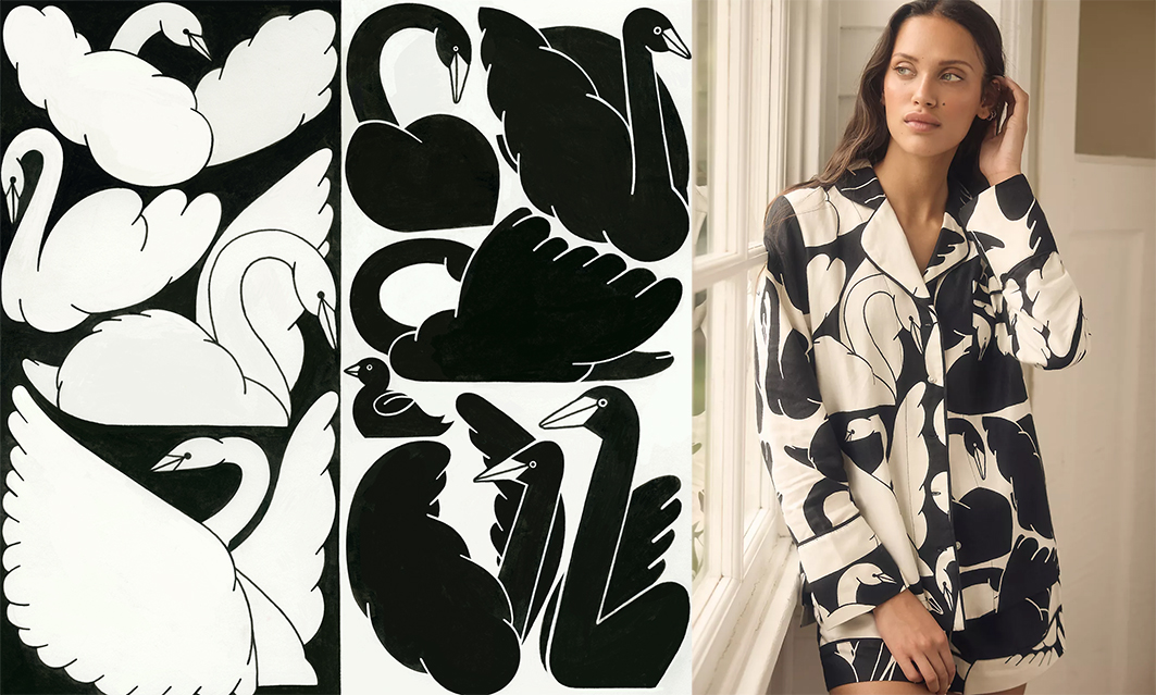
I usually define myself as a print and pattern designer. I draw and illustrate placed prints (illustrations) and repeated patterns.
How did you first become interested in print design, and what inspired you to pursue it as a career?
I studied design at HDK, the Academy of Design and Crafts at the University of Gothenburg, Sweden. After graduation, I conflicted with myself - Should I focus on graphic design, illustration, or product design? Going forward to my master's degree, I decided to specialize in pattern design because it includes all the above. It's multidisciplinary, and every project is different. Sometimes, my prints end up as fabrics, as wallpaper.
Scandinavian design is often associated with simplicity and functionality. How does this influence your design work, and do you have any favorite design principles you like to incorporate?
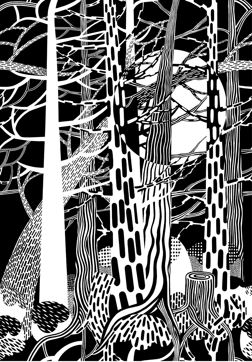
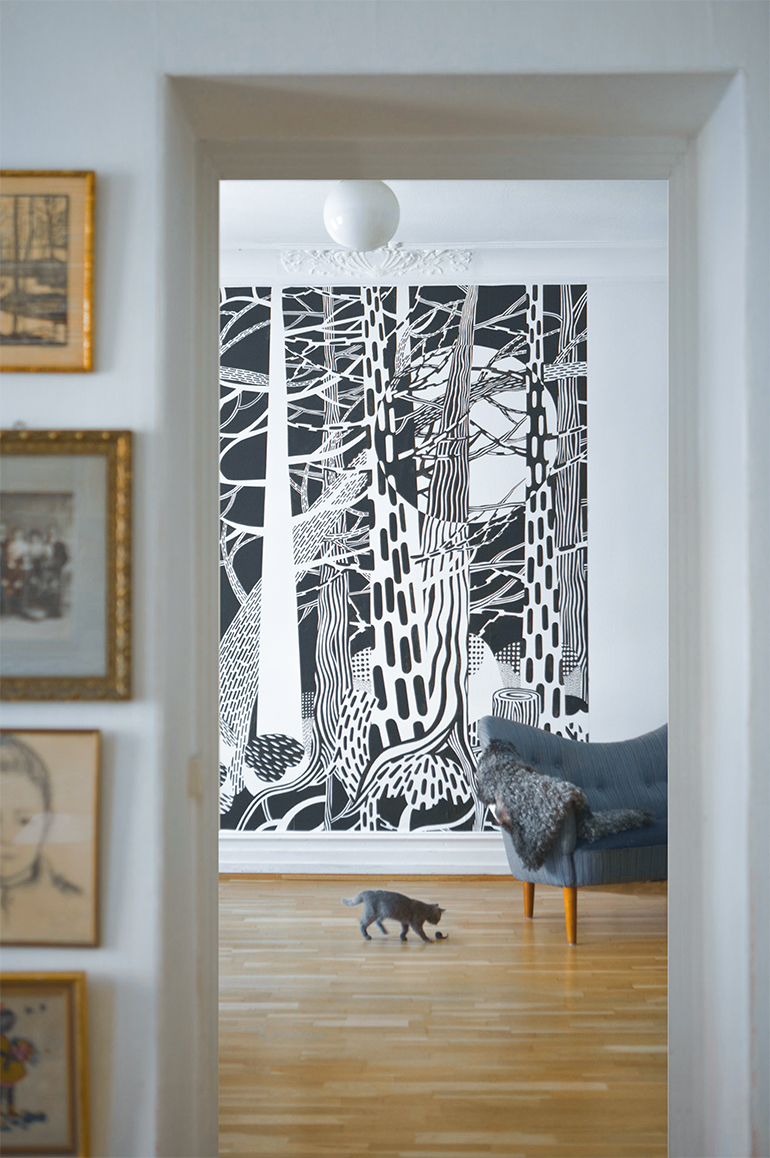
I think my design language is far from the Scandinavian style. Mine is “more is more” and Scandinavian design is often “less is more”. But I am very much influenced by the surroundings of Sweden, the nature. My motifs are often from the Swedish fauna, and I love to draw the forest.
Can you describe your creative process when developing a new design? Where do you typically find inspiration?
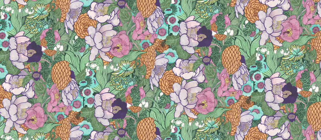
Most of my inspiration comes from living in Sweden, close to nature. My motifs come from my childhood and Swedish nature. I usually work with memories and the idea of something rather than how it actually looks. I don't like to draw from photos. If I draw a flower, for example, I like to have the actual flower in front of me. So, I can see how it grows and blooms.
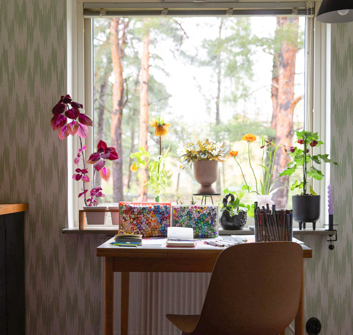
I am not much of a sketcher, so I love my Copic markers. I usually start with the ink and then develop the design around what happens on the paper. I have a rough plan, but most of the time, it's go with the flow!
Scandinavian culture and nature are rich sources of inspiration for many designers in the region. How do you incorporate elements of Nordic culture or nature into your designs?
Yes, very much! It´s my biggest source of inspiration
Given the strong traditional craftsmanship in the Scandinavian region, how do you balance tradition and innovation in your designs?
I think, for me, it has more to do with trends. Should I draw like the trend is, or should I go my own way? Most of the time, I don't bother with trends, and I don't care about following tradition. I just do my thing - My own way.
Can you share a project you're particularly proud of or one that posed unique challenges in its creation?
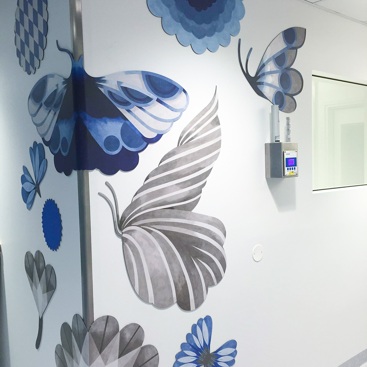
I have done two public commissions so far. One was for a hospital, and I worked in the waiting rooms. I made repeating patterns that were in the ceilings and on the walls. I worked with the butterfly and how it changes as a symbol of life. This part of the hospital had a lot of cases that were yes or no. Like, will I live, or will I die? I was working with the butterfly and how it moves in its circles and then breaks its repetition and just flies another way - Take a new journey. Working with this concept made me think a lot about what art and design can do for people when they are in critical places in their lives, and how important it can be.

Collaboration is often an essential part of the design process. Have you collaborated with other artists or designers on any projects, and if so, how did these collaborations influence your works?
I think collaborations for me are more about working with a client and the ideas they have. I get a brief assignment, and then I translate that into something visual. Sometimes, that visual is exactly what the client was asking for, and sometimes, it takes a lot of rounds to get the same idea. That kind of collaboration is always very inspiring. For me, it's communication through my drawings, and I try to fulfill the client's vision. I love collaboration!
What art materials and techniques do you prefer to use in your designs, and why?
I mainly work with Copic markers! My favorites are the colored Multiliners. I wish they came in more colors because I love them. If you look at my portfolio, you can see the color scheme of the Copic Multiliners and see that the cobalt blue is my absolute number one. I use Copic markers when I work with painting. For me, it's almost like painting with gouache or other liquid colors. I use them in the same way - Layering, mixing, and building surfaces. The transparency is the best thing, so you can layer almost forever. There is no end!
When did you first start using Copic markers (or other Copic products such as Copic Multiliner pens), and what made you use them?
I started using Copic in 2007 when I began to specialize in patterns. I liked the richness of the colors, how permanent they become, and the smooth surface if you use the right paper. A lot of pattern designers traditionally work with gouache. I wanted to try something different, and I like to draw with a pen. So, Copic became my way of painting, working with fields of color and building depth through layering. So much fun! And they come in so many colors!
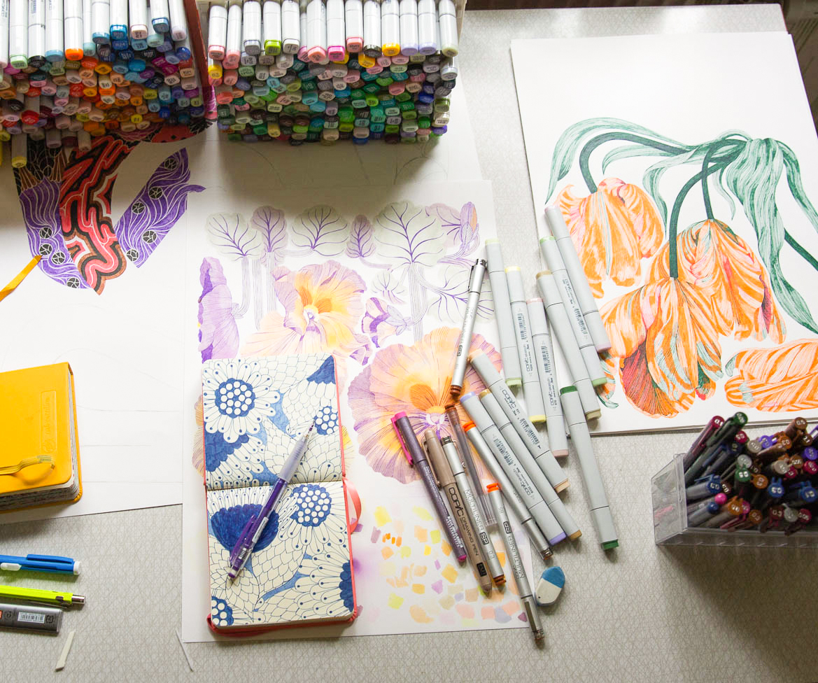
What is your favorite Copic product?
It's the Copic Multiliner, for sure! I love that they come in different nib sizes. For coloring, it's the Copic Markers because you can change the nib to a small one. That way, I can draw extra thin lines. It's also fun to airbrush, and so many things you can do with the different versions of the nibs and ink for the Copic Markers. I feel like I could spend my whole artistic life just exploring Copic products!
Color plays an essential role in design. How do you choose color palettes for your design, and do you have any favorite Copic colors or combinations you use often?
I am addicted to YG45, Cobalt Green. It is the most perfect green color I have ever seen. I use it a lot - Almost all of my designs. When I work with clients, I usually get a palette to work from, and then I translate the Pantones into Copic colors. Sometimes, I mix/customize colors to get the right shade.
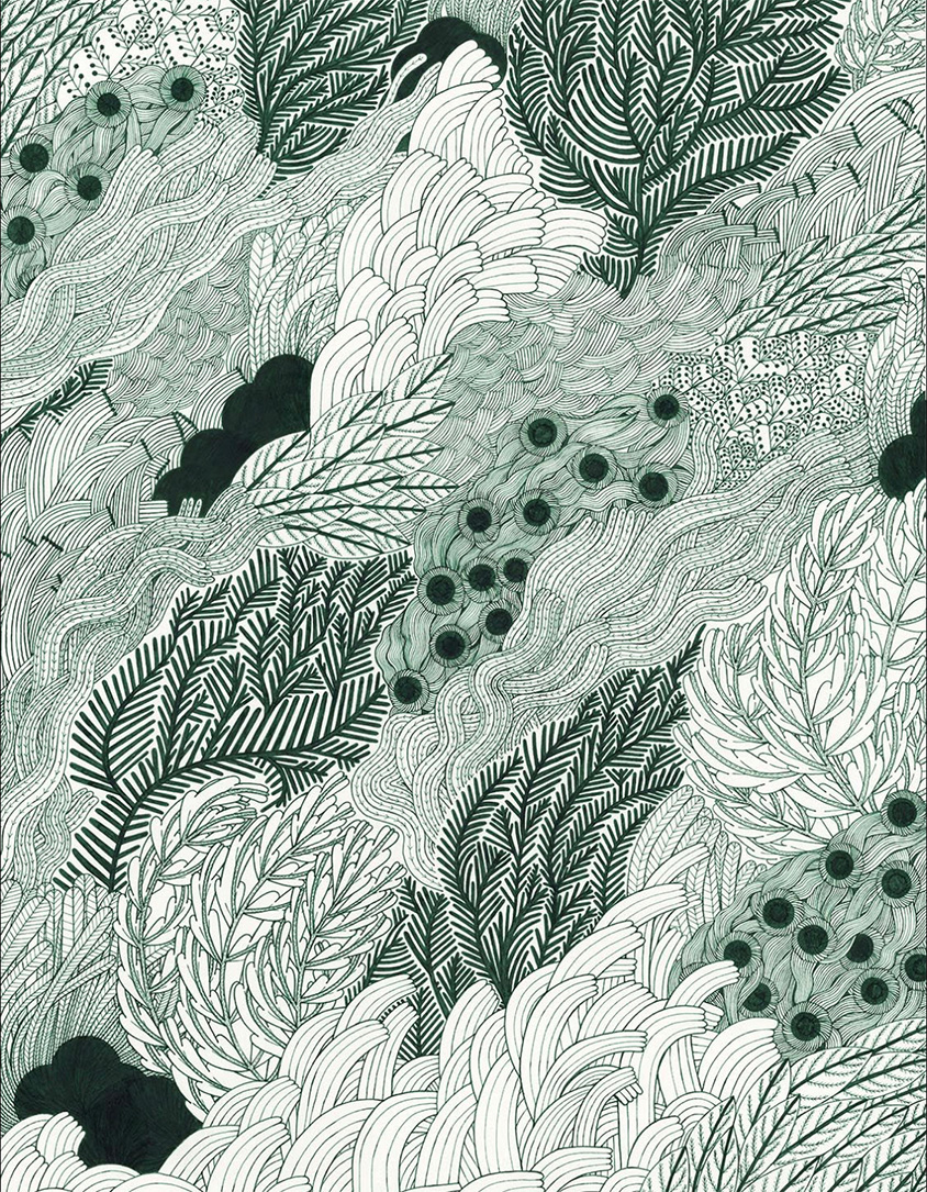
The beauty of your works and your skills in Copic markers is remarkable. Do you have any unique tips or tricks you could share with Copic fans?
Combining colored Copic Multiliners with Copic Markers is great fun. You can do so much with them. I think the Copic colors are so nicely balanced. Almost all the colors you need are there, and if not, you can mix them up by working with layers or filling in an empty pen!
Could we have your message or advice for aspiring Copic fans who want to become professional designers or illustrators?
Explore and examine the pens. See what they can do. Don't be afraid to rework or throw away work. Even bad work is still your work. Practice is the key! Push your limits by going with the flow. Don't sketch, just draw. Use the right paper - It is all about the paper.
