- Category:
- All
- Design
- Illustration
- Manga
- Craft
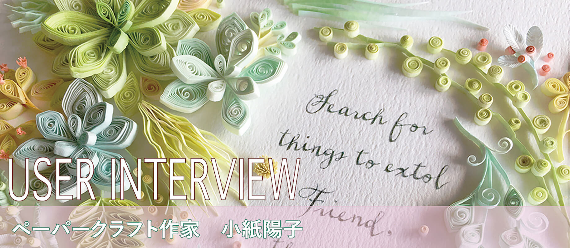
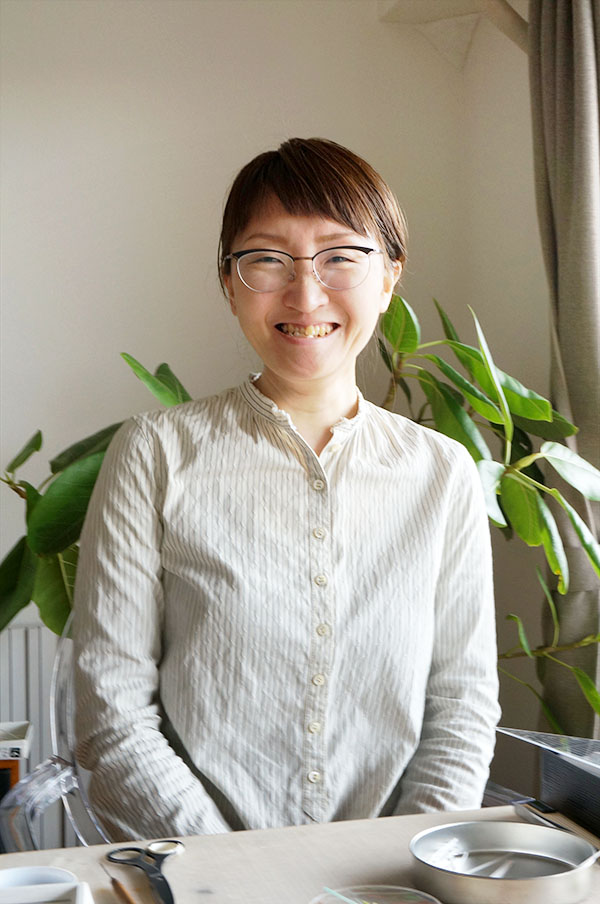
Yoko Kogami http://kogamicraft.com/
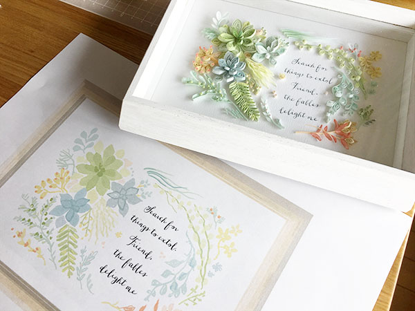
Ms. Kogami is an amazing quilling artist/graphic designer born in Chiba, Japan.
She also acts as a creative adviser to Botanical Quilling Japan and has been working on many projects in the motif of plants.
Ms. Kogami is active in the front lines of quilling scene in Japan - Her artworks constantly appear on posters for commercial advertisement, or the cover of magazines and books.
Ms. Kogami has published several how-to books and these books are well-received by everybody from beginners to experts of paper quilling.
■About Paper Quilling:
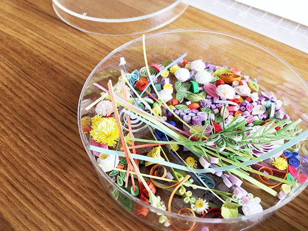
Quilling (so-called paper filigree) is a form of paper craft that uses strips of paper that are rolled, looped, curled, twisted and glued together to create decorative designs.
Paper quilling has its roots in Medieval Europe.
During the Renaissance, monks and nuns at that time used quilling to decorate their book covers and religious items.
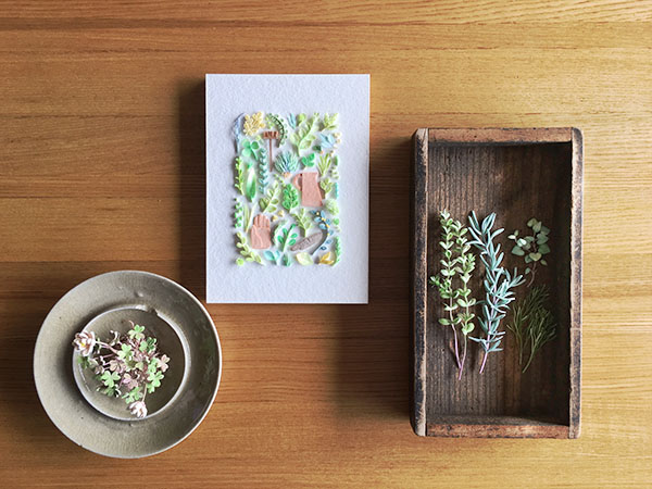
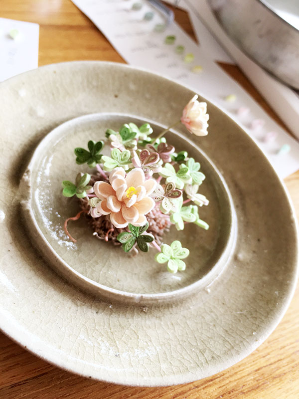
* "Botanical Quilling" is a specific genre of quilling which expresses the shapes and textures of the smaller parts of plants.
We interviewed Ms. Kogami, one of the leading quilling artist in Japan and famous for elaborate artworks which look exactly like the real plants, about her engagement with Copic.
Copic's biggest draw is I can create almost infinite colors by layering colors
― When did you first start using Copic markers? What inspired you to use Copic ?
I encountered Copic for the first time when I was a student at design school. I guess the school had provided us Classic 36pc Color Set as study materials. Unfortunately we haven't had much chance to use them in the class, though.
Then I discovered Copic again when I was working as a graphic designer/illustrator at design office and making a catalog for handicraft related products. I was so impressed by the quality of Copic - Marker was still a standard tool in the industry around that time, but the lines printed out from a photocopier would have been destroyed by ink in most cases.
On the other hand, Copic was the first photocopy-safe marker. Copic is so easy to fix mistakes and it does not take too much time to dry unlike watercolors. It was really amazing.
― When did you start paper quilling?
One of the items featured in that catalog was a handmade kit for paper quilling. I was chosen to make the examples so that the customers could easily understand what paper quilling is, or the finished piece would be looked like. I continued to make all these examples and thanks to my boss's good presentation to a publishing company - I was able to publish two books about paper quilling.
― Were you already using Copic at that time?
No. That was before I begin using Copic.
I was using store-bought color papers made for quilling back then.
― How did you begin using Copic in your work? Could you give a little bit of background?
The papers I was using in the early days, were foreign imports. The colors were too vivid and not my taste - It was pretty difficult to express subtle atmosphere or mood I wanted with those papers.
Then I tried Japanese-made color papers. These papers had a greater choice of color but I still couldn't found the right color for my work.
And Copic finally came to my mind! With Copic, everything began to work out fine the way I wanted and I was able to create the colors and atmosphere I needed.
I love Copic because it provides limitless possibilities by layering the different colors, in different combinations. Also, it's really easy to use and care!
The subtle nuances and a sense of depth can be represented by layering the colors
― What is your favorite colors in a Copic lineup?
I like the colors that can vibrantly recreate the beauty of plants. I like V000orBV00because I would often mix the bluish and pinkish colors when I color the flowers. YG01,YG11andG82are the must-haves to color the plants... Oh, I must never forget G40! It would be a huge problem if I run out of it... Also, I’m really into YG03recently.
― How do you use Copic when you work on your project?
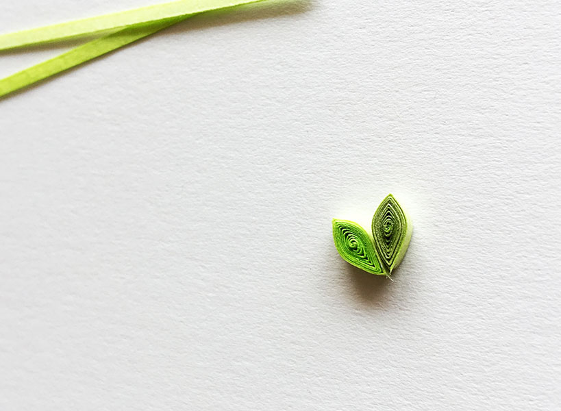
I don't use Copic with just a single color. I layer more than one colors in most cases. Recently, to express vintage-like look and feel, I'm experimenting with layering the bright colors and relatively dull colors.
Here's an example. Left is a leaf colored with YG01only. In the right, the same YG01has used as the base color butV000has been layered afterward. Can you see the difference between these two?
― It looks the right leaf has more subtle, softer shades of green.
As you can see, the layering technique offers a sense of depth or the subtle nuance. It may be a little difficult to understand the effect just by looking at the each part, but once all the parts are combined as one artwork, you will know it makes a tangible difference as a whole.
― How do you choose the paper? What type of paper do you like best?
I'm using the Japanese paper developed for learning "sumi-e" (brush painting). I chose this specific paper by actually touching every types of Japanese paper in store shelves!
Like the watercolor paper, it's almost solid white and slightly textured, has proper softness and thickness.
Of course this paper goes well together with Copic and provides the clean coloration.
― Is there any techniques or methods contrived by yourself?
This is not my original technique, but layering the color is one of the most important element. This is an absolute essential for my artwork.
I don't need to give a lot of attention to the flowers because they already have intricate, beautiful and eye-catching shapes. On the other hand, the leaves never look beautiful if I don't enhance its appeal by layering the colors. So I control the speed of applying the colors to create the subtle difference in the shade of color on each and every leaf.
For example, If I apply the ink slowly, the tone of color would be darkened. I also adjust the order applying the colors. Sometimes I even use the incidentally-occurred color unevenness on purpose.
When all these techniques are used in combination, the natural feel and a sense of depth can be represented.
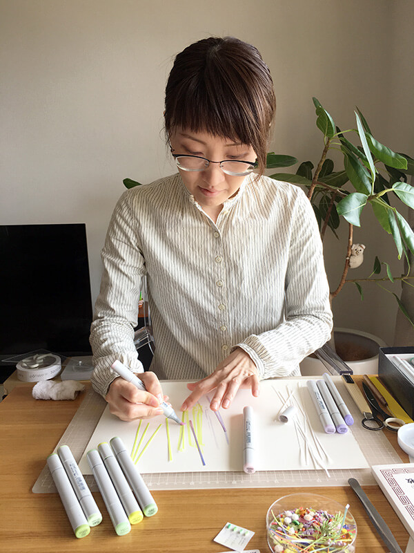
Creating a color map and color reference
― Do you draw up the design before you start creating your artwork?
I preliminarily convert my rough idea into a digital graphic. Then I make a color map and strictly set the coloration for each part in advance so that I don't need to puzzle about the color combination later.
If the color balance is satisfactory to myself at this point, I can smoothly advance the creating process with no compromise of the color.
Also I make a color reference guide everytime I start a new project because the color may slightly changed due to the remaining amount of ink, or deterioration rate of Super Brush nib.
Before I started using Copic, I was bound by the limited options of color paper, but Copic gave me more freedom in terms of recreating the color because Copic allows me to accurately make the colors I planned in a rough idea. The color is the most important element in my artwork so making a color map and color reference is sort of requirement.

― I understand exactly what you're talking about. Your passion for the color is amazing.
The color of every leaf is different. I'm representing those subtle difference by combining the lighter colors like 00 and 000. Of course the type of paper and working sequence would also affect the final result. For example, even the same color, it would look differently depends on the timing of applying (before or after rolling up a piece of paper).
I never compromise to fulfill my vision. This is what I'm telling my students at Botanical Quilling Japan* all the time.
* 1 * Botanical Quilling Japan (run by Correspond Corporation) is a group that specializes in intricate paper art, which expresses the beauty of plants and flowers. They are publishing the books about quilling, and organizing the event/course/class.
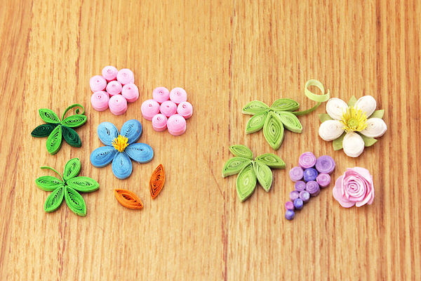
Left are the parts I made with store-bought color papers only. Right are the parts I made with a little help from Copic. The left parts would be enough if you want to create something bright or "pop", but if you want to express some subtle nuances, you'll never make it without Copic.
― Each of them has its own distinctive taste!
Yes, and Copic is an indispensable tool for expressing the images in my head.
― Could we have your message for Copic?
Happy 30th anniversary! Copic really helped to shape my own style.
I would not be here without Copic! Thank you!