- Category:
- All
- Design
- Illustration
- Manga
- Craft
Kotori Hana
Ms. Kotori is an illustrator from Yamanashi prefecture, Japan.
Her illustrations depict a sweet and colorful world with motifs of girls, flowers, and cuddly animals.
Ms. Kotori's signature style is the gentle and warm touch on her illustrations. She continuously posts her works on pixiv and Twitter, and contributes illustrations and illustration-related articles in various magazines.
She is the co-author of "Copic de kakou! Kara irasuto jyoutatsu making" (Let's try Copic! Illustration making improving manual).
“It’s fun to bring out the deepness of illustrations
by layering light colors”
When and how did you start using Copic?
I started using Copic by chance, as they were supplied by my fine arts club in middle school. It’s been 8 years since I started using them. At first, I used the colors provided at school. After some time, I picked up my favorite colors and started my own collection.
So, you started buying Copic from your favorite colors at that time. Can you tell us what were those shades?
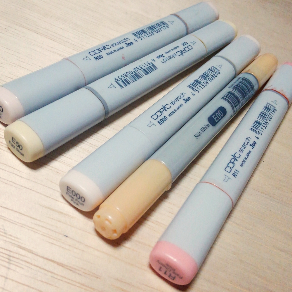
I started with 5 colors. If my memory serves me correctly, I bought RV21, Y06, YG03, BG01, and YR15.
Can you tell us what are your favorite character portrait shades?
I like R00 and E50 because they are light, gentle and cute colors. I often use them in my artworks. I use E000, E00, R00, and R11. The colors I use in my illustrations change depending on the subject.
What do you like about Copic?
I like how expressions can change dramatically based on the way you use them. I love how you can create gentle and sharp artworks.
Do you have any particular techniques for using Copic?
I use them instinctively but take great care in layering colors. The color richness of Copic comes out with layering, so I layer the shades until I am satisfied with the results.
I love the light colors; it’s fun to bring out the thickness of colors by layering shades.
“I use Copic with watercolor pencils.”
Do you have any favorite themes when creating an artwork?
I love to draw girls’ dresses, hair, and facial expressions. My motivation goes up when drawing something I like. Besides characters, it also feels good to draw flowers and animals.
Do you use any references when drawing?
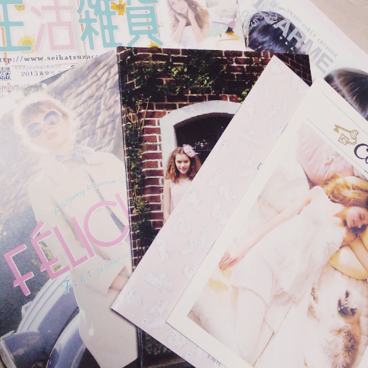
I always check my pixiv bookmarks and illustration rankings of my favorite artists. I also look at various sources including magazines relating with clothes, furniture, and free advertisement publications. I also read a lot of manga to find inspiration and incorporate expressions in my drawings. (An example of the magazines Ms. Hana uses as reference)
What do you take into consideration when choosing the paper to be used for an artwork?
I consider greatly how much ink the paper absorbs and how colors run on it. It’s hard to control the colors if they spill too much on a sheet. Though, papers that don’t make ink spread at all don't fit with my drawing style. I like watercolors and drawing paper.
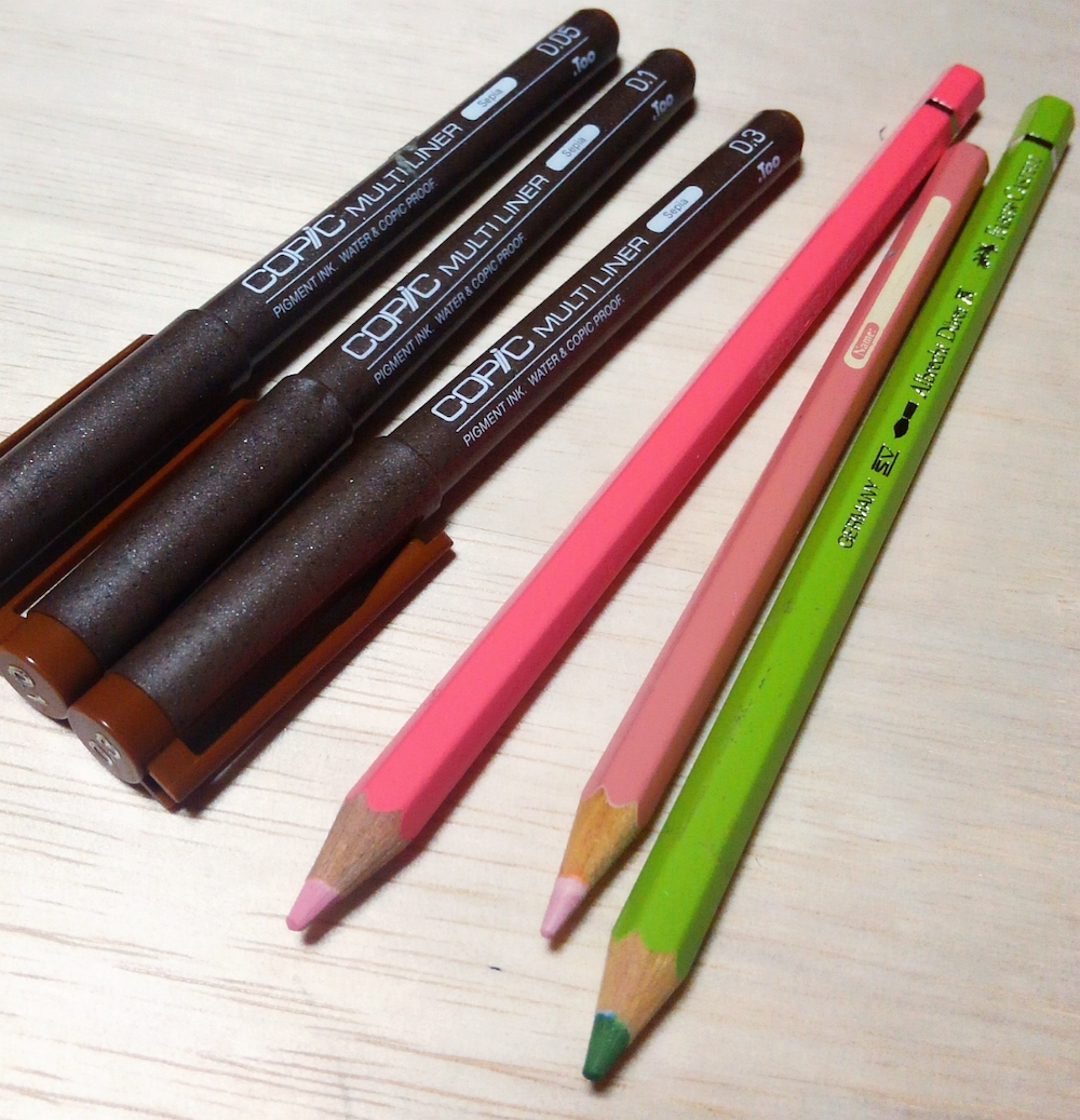
What do you use for line art?
I mostly use Copic Multiliners and I like the 0.1 and 0.3 models because of the drawing feel. The sepia Multiliner is my favorite. I use watercolor pencils when I want to create a softer image.
So, you use watercolors pencils with Copic.
Yes. It’s fun to use Copic markers and they are great to create a soft finish by layering both the pencils and the markers. It’s also possible to camouflage color streaks with this technique. However, I don’t really use watercolors pencils as a main medium.
About "Vibrant"
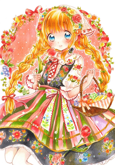
You used the Copic Sketch Manga Illustration 24 colors set for today's artwork. Could you tell us your impressions of this set?
To be honest, it was something new to me because I only own 2 or 3 shades of this set. At first, I did a lot of layering practice because I didn’t know what kind of shade and results would come out with these colors. For the skin, I used a pink shade that was softly mixed with Y000, a yellow color. This experience made me think and experiment with ways to recreate the colors I usually apply, such as the cream color for the skin. I use the same shades and mixing pattern, so it feels like I became attached with them.
How was it becoming familiar with new, unknown colors? Did they influenc this artwork?
At first, I wanted to make a softer drawing. However, this set offers a lot of vivid colors, so I made a girl wearing a traditional dress. It's a subject that I wanted to try out from a long time ago but never had the chance.
I never used black and dark gray tones for clothes, so it was hard to decide how to put the colors together, but the dark tones wrap the vivid colors perfectly. I’m satisfied with the final result, and I was able to create a character that’s different from my usual style.
The main feature of this set is the possibility to create a wide range of shades regardless of the limited number of colors. Did it feel challenging to use this set?
I tried a lot of color combinations to create a natural green shade for the plants in the artwork because there is only one green tone in this set. Using a trial-and-error process, I found a new color combination that I liked and I will use it in my artworks from here on. It was refreshing to draw with new colors, and it felt like a big adventure. Indeed, the best feature of this set is the ability to create an endless variety of new colors by mixing and overlapping tones. I want to find more color variations with this set.

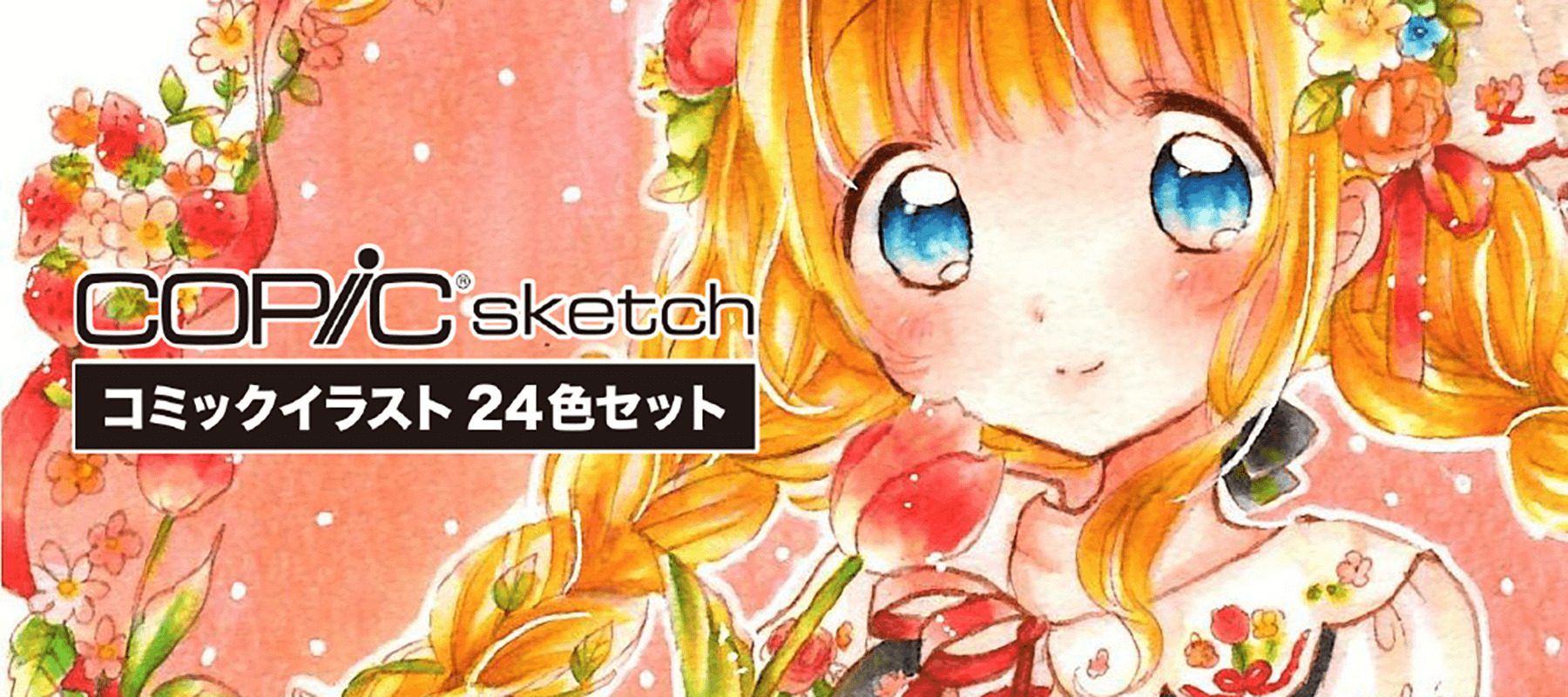
The set used in this illustration:
Copic Sketch Manga Illustration 24 colors Set

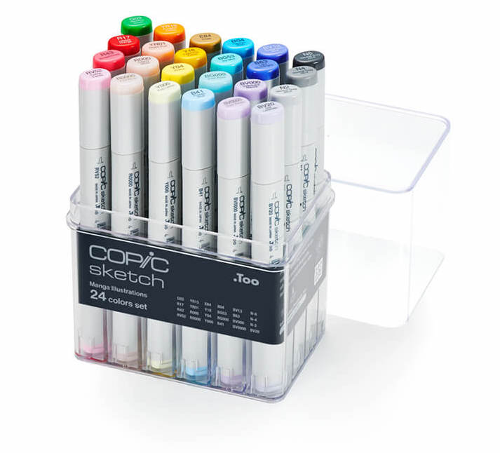
The ideal starter set for comic illustrations, it combines vibrant colors with matching blending shades and a selection of skin color tones.
The included pale colors, a unique feature of Copic, will allow for gradation and blending techniques with professional results.