- Category:
- All
- Design
- Illustration
- Manga
- Craft
Akiko Nakamura
Exterior/interior designer, calligrapher, and professor at the Machida Hiroko academy.
She mainly focuses on architecture design and holds calligraphy lessons at her "Atelier Elegalea."
"One of the Copic advantages is the Earth family color variety"
When/How did you start using Copic?
At the start of my career, I used Speedry paint and other brand markers from abroad. All of them had a strong alcoholic smell, and they made the toner dissolve. It was so surprising to use Copic markers without melting the toner at the time.
Did you use Copic markers from the start?
When Copic markers were released, they came out with just 71 shades, so I didn't adopt Copic right away. I jumped to Copic when the Sketch model and the Earth tones expansion pack was released.
So, you use Copic Sketch for work.
Yes. I mainly use the broad nib for my drawings and the brush nib for the artwork details. The Copic's Sketch ample color palette is so handy. However, I use Copic Classing during my lessons since they hold more ink.
What do you like about Copic?
I love the Copic streaks because you can create different textures thanks to it and the colors' bright shades.
What are the colors you use the most in your works?
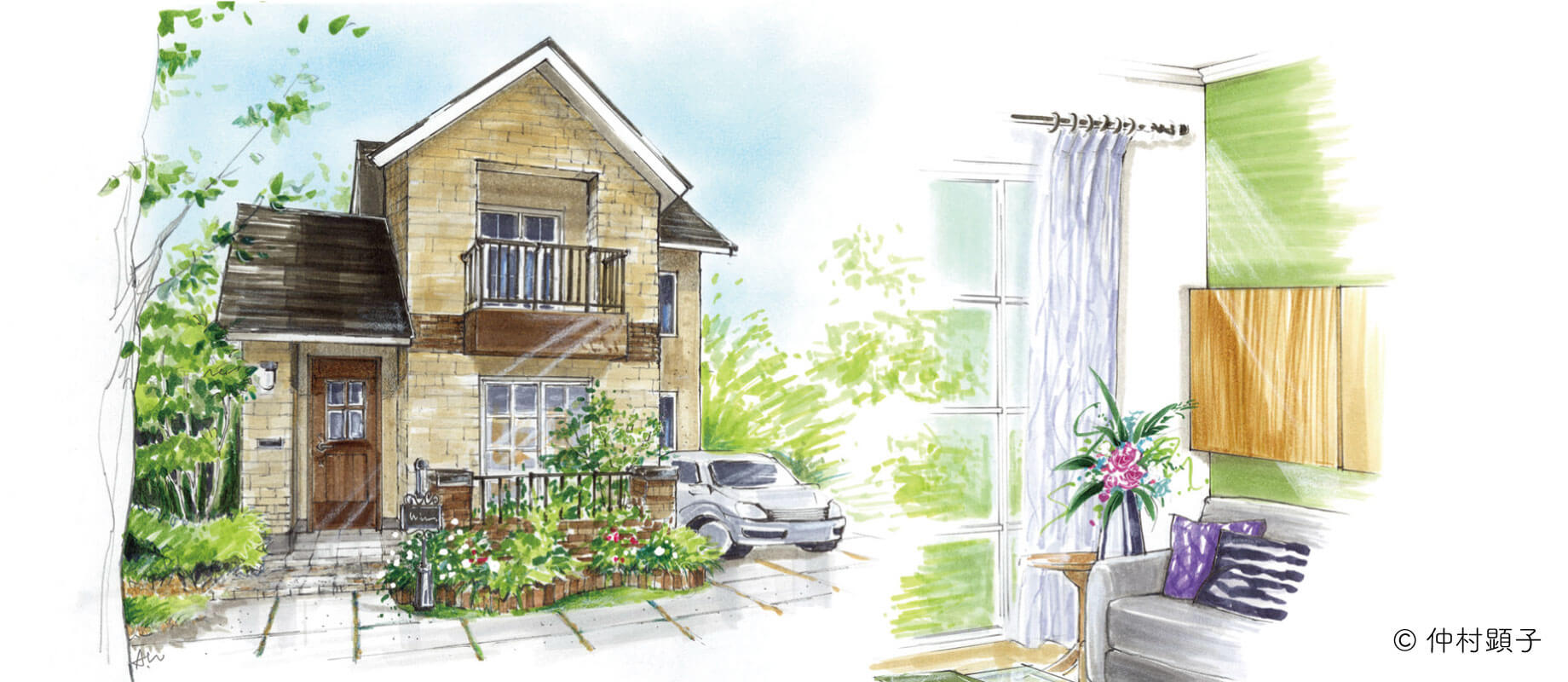
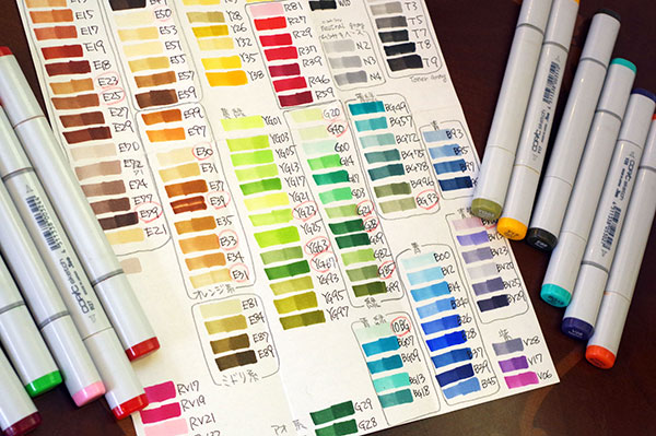
I mainly use the E family colors for exterior/interior design. My favorite shade is E07, a reddish-brown. Besides Earth colors, I also use blue and violet tones for the interior details. I always carry a handmade color swatch card with the Copic colors layered two times.
I see you have a particular way to differentiate colors.
Even the colors in the same family have different vibes. For example, I group "orange" browns, reddish-brown, and greenish-browns or differentiate the shade based on the use: T family is for concrete, etc.
"Handmade works conveys feelings."
What other art supplies do you use besides Copic?
After I make a draft with pencils, I print my designs on PM paper and then use Copic, pastels, and colored pencils on the drawing. These art supplies blend so well together with PM paper.
The "PM" on PM paper means "Pastel & Markers." I'm glad to hear that it fits your needs. Which size do you usually adopt for your works?
Oh, that's why they blend so well together!
I use A3 size to send my work to design agencies.
So, you are particular about handmade drawings.
I take great care about creating pictures that make people feel the warmth of handmade illustrations and imagine themself inside them. One of the best features of analog illustrations is fixing the coloring based on what you want to communicate. For example, adding notes or other elements in the parts you want to be noticed or blurring the background. One of the best examples is that sense of speed felt when watching car design sketches.

| ■About PM paper |
|---|
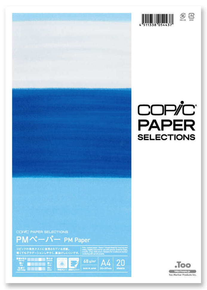 A long-selling paper loved by a lot of designers including Ms. Nakamura. This paper works well with not just Copic markers but with pastels and colored pencils as well. The product comes in 2 different models: the pad type "PM pad" and the standard type "PM copy paper". We recommend the A4 model (20 sheet) for those interested in trying out this product. |