 Message
Thanks to everyone’s love and support, Copic celebrates its 35th anniversary this year.
Copic was developed to be "a marker that does not dissolve copier toner and is easy for designers to use" and was named after the word "copy". After becoming a hit among designers years ago, Copic started to be used in various genres of the art industry: Manga, illustrations, caricatures, fine art, and hobby/craft.
As we celebrate our 35th anniversary this year, we would like to extend our sincere gratitude to you for your continued patronage of Copic. We will continue to provide support so that you can fully exercise your creativity.
News
- 2022.4.20
- 35th Anniversary page is now open
 What is Copic?
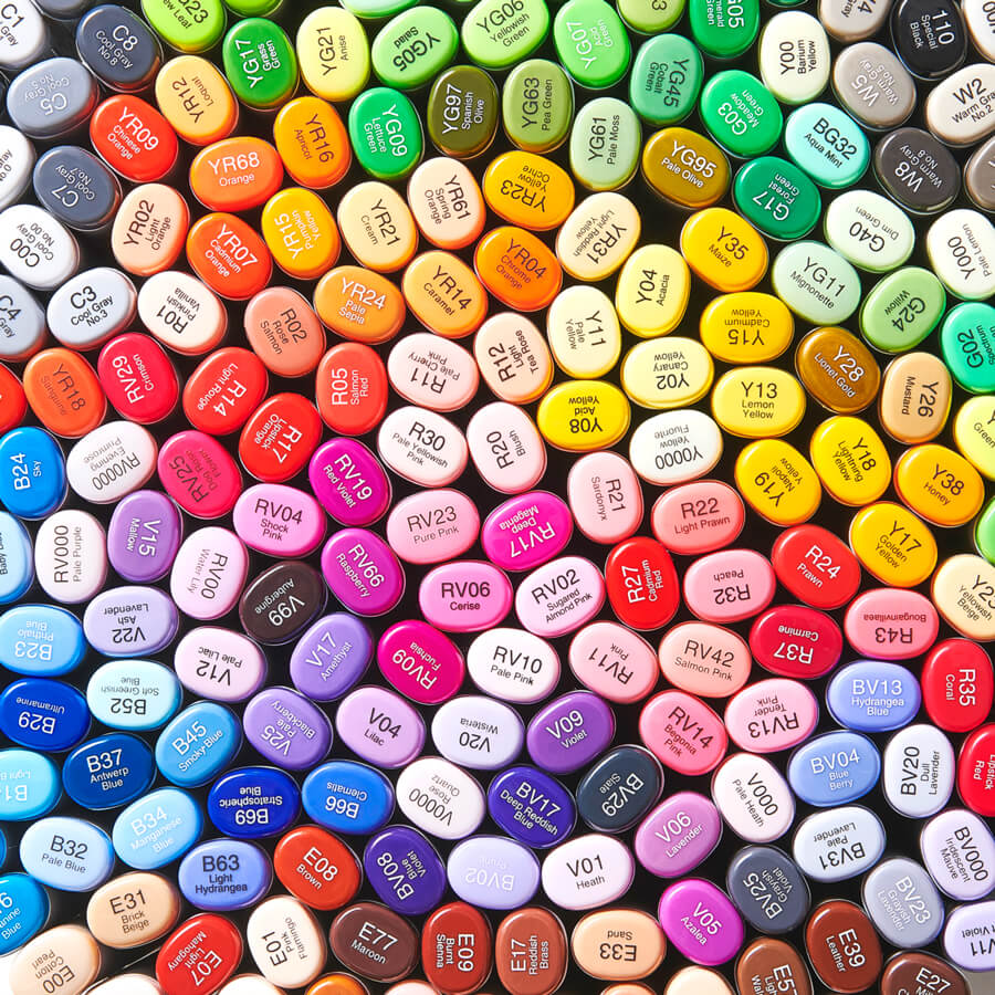
358 colors
Copic offers a vast 358 color palette. After the release of the first 72 colors, we continued to develop and add tones based on artist requests. You will surely find the colors that you want to use.
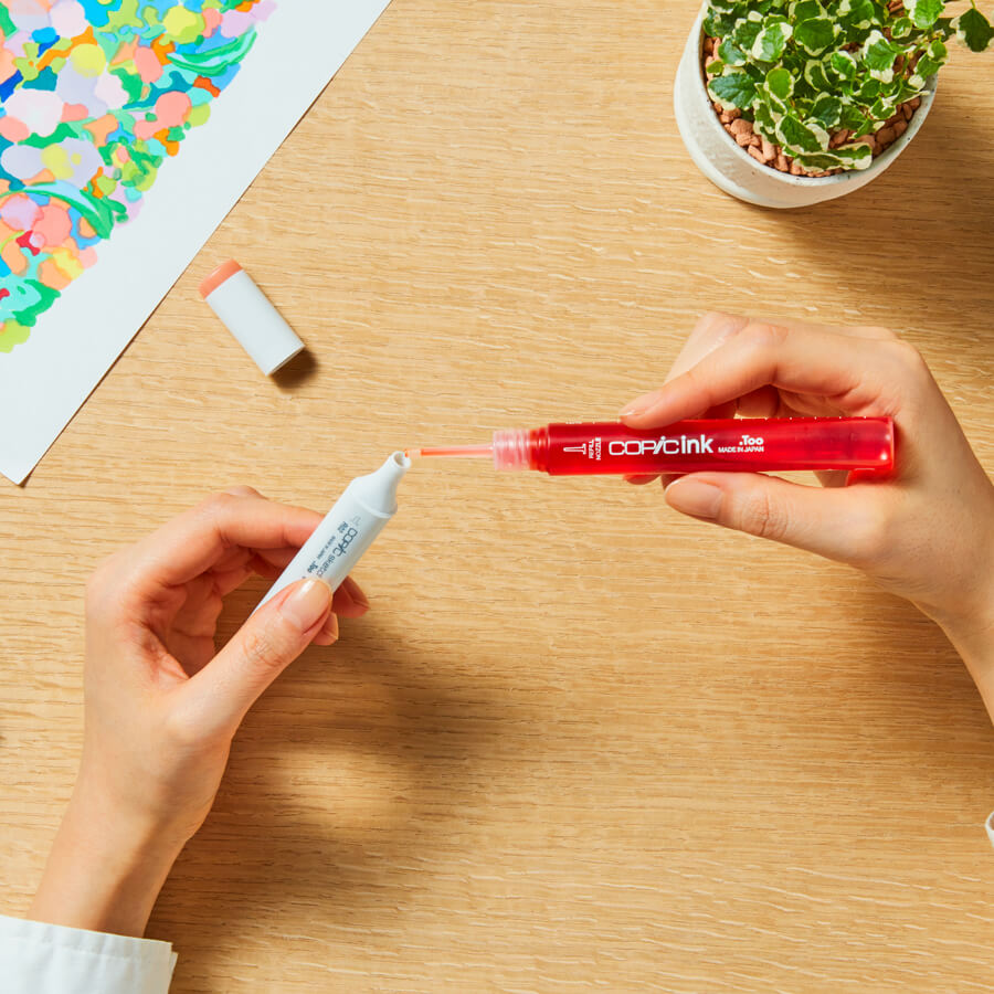
The sustainable marker that lasts a lifetime
Refill ink and replaceable nibs are available for all Copic models. Even if ink runs out, a marker/Copic markers can be used repeatedly by refilling the ink.
The longer you use Copic markers, the more you save, making them eco-friendly and sustainable.
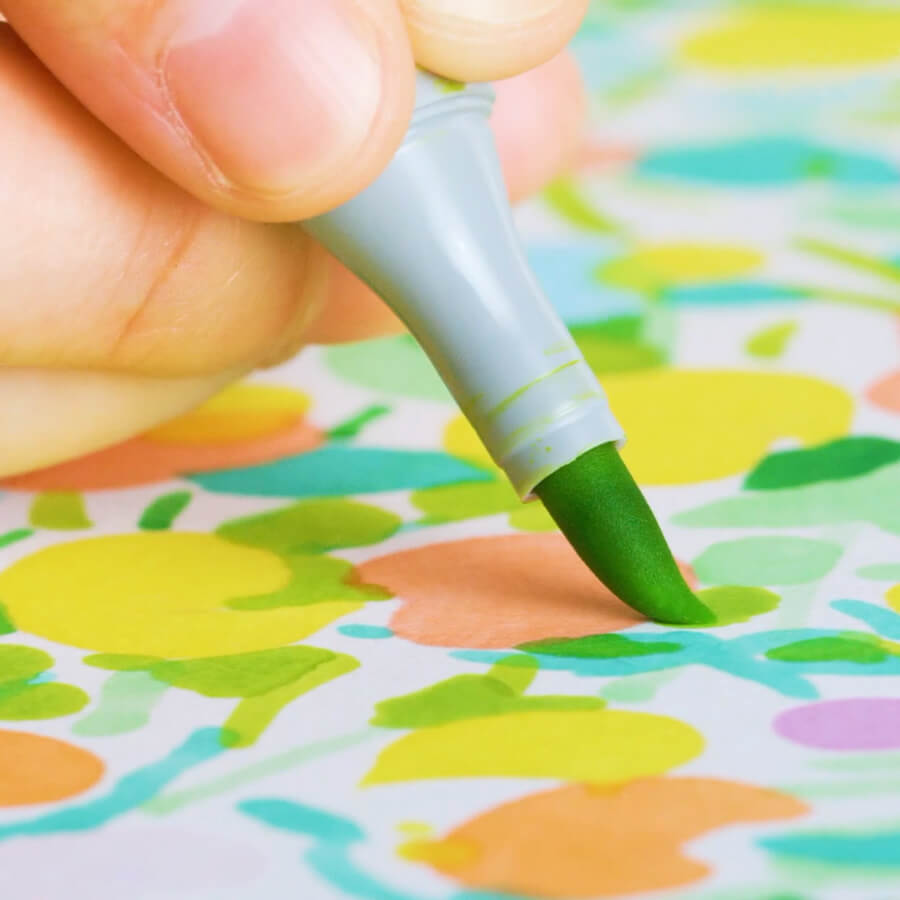
Fast-drying alcohol dye ink
that lets your creativity flow.
Copic contains a fast-drying alcohol ink. There is no need to wait for the ink to dry, and it is easy to use without damaging paper or getting your hands messy.
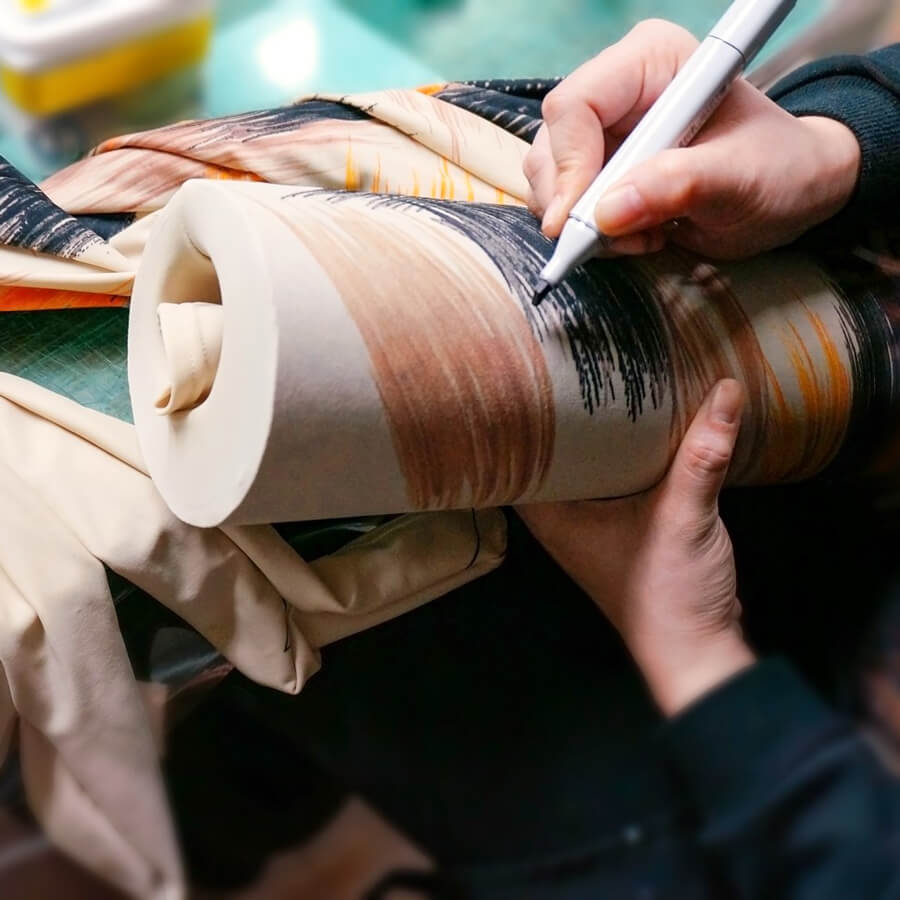
Infinite possibilities
Initially developed as a rendering tool for professional designers, Copic is now used in many other fields including illustration, manga, fine art, manga, and journaling. In addition to drawing, Copic is also used in a variety of fields as a versatile coloring medium, taking advantage of its vast range of colors and ease of use.
History
1919
Foundation of Izumiya
Ms. Ishii Soyo opens Izumiya, an art supply store in Tokyo's Shibuya Ward, and begins her career in importing art supplies.

Markers become popular tools among designers and to meet this demand, Izumiya starts importing and selling Speedry Markers, an American brand developed exclusively for this audience.
1963
Import of Speedry Markers begins

1968
Production of Speedry Markers in Japan begins
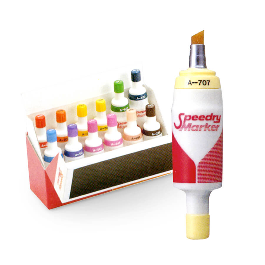
American Magic marker and Izumiya form a joint venture called 'Magic Marker Corporation Japan' and start domestic production of Speedry Markers.

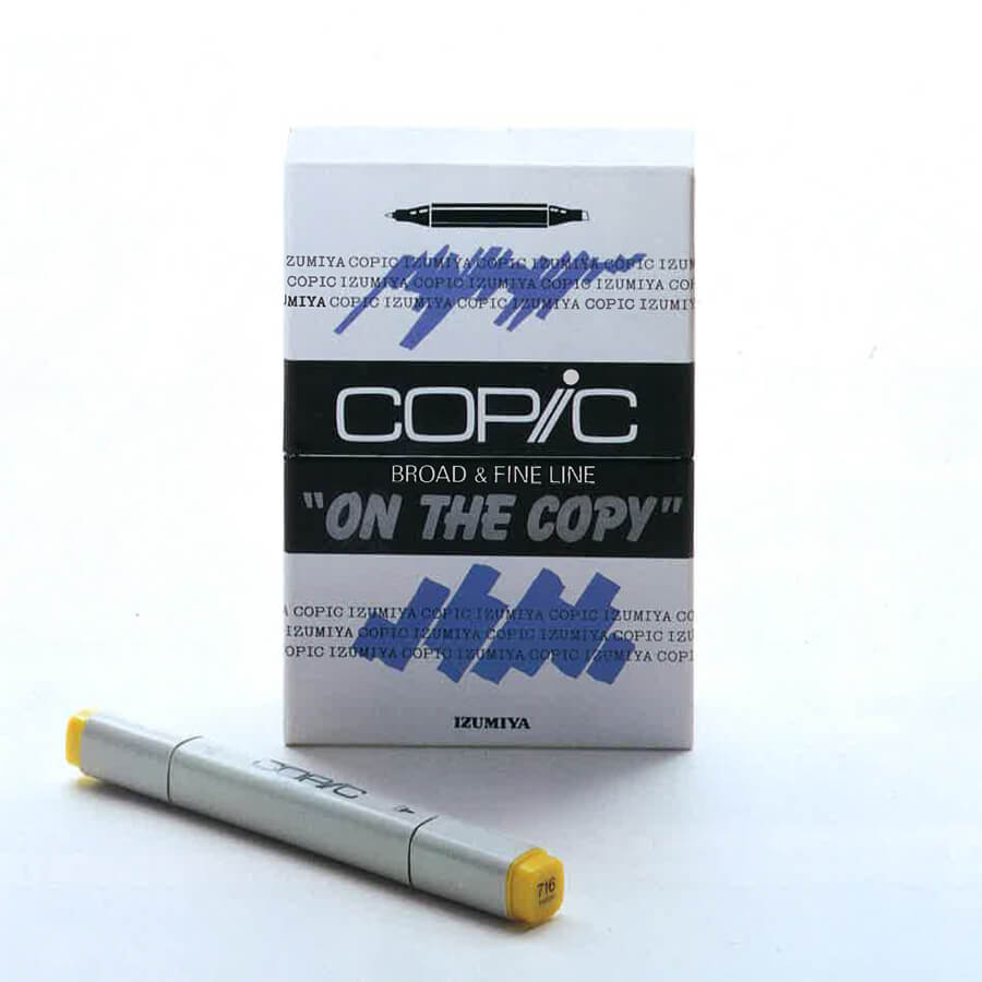
1987
Izumiya develop the next generation graphic marker that would enable designers to work with freshly printed photocopies without issues.
The new marker was aptly named Copic, deriving from the word “copies” and the pale gray chosen was similar to the color of copy machines at the time to create a close link to the origin.

1993
Launch of Copic Sketch
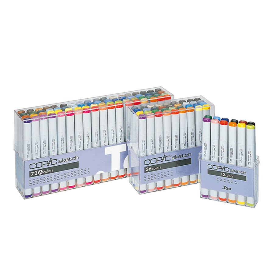
A brand-new drawing experience is introduced which transforms the market. The innovative Super Brush with properties similar to a paint brush was adopted by manga and cartoon illustrators and became the primary tool in many fields of design and crafts.

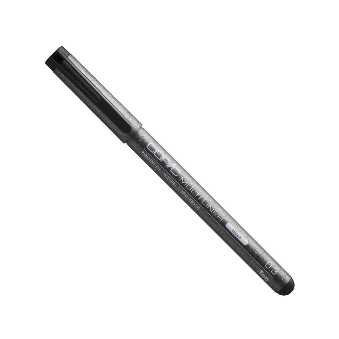
Sketching and drawing pens are introduced with water-resistant pigment ink to avoid any blurring when used with Copic markers.
1994
Launch of Copic Multiliners

1995
Launch of Copic Airbrush Set

An innovative tool to create airbrushed effects with Copic markers is introduced.

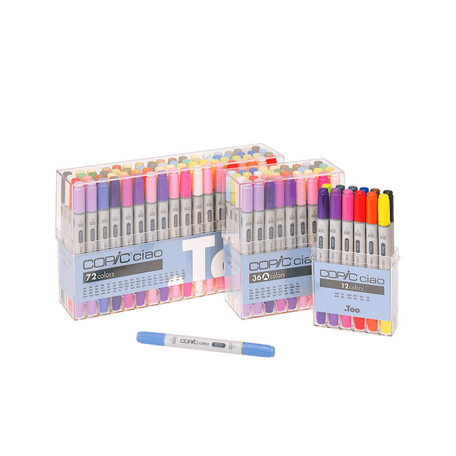
A new entry level graphic marker is introduced with a line-up of 72 colors specially selected for beginners.
1998
Launch of Copic Ciao

2009
Copic receives Good Design and Long Life Design Award
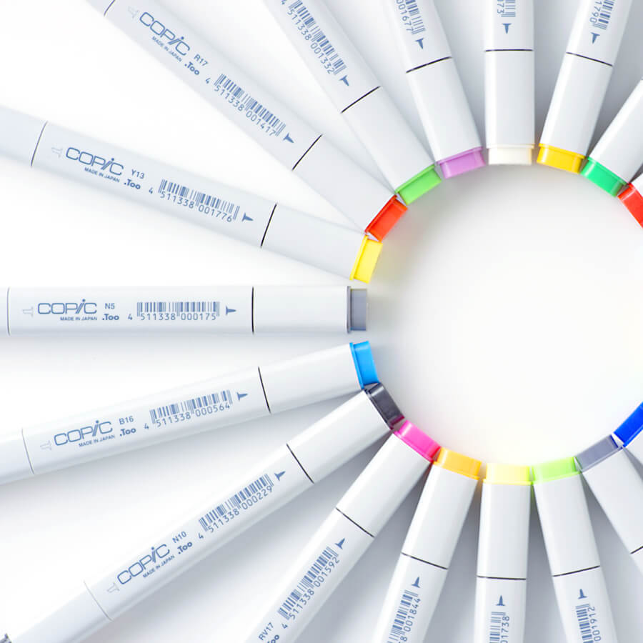
Copic receives Good Design and Long Life Design Award


To commemorate the 30th anniversary of Copic markers a yearly Award is launched, it is open to all Copic users worldwide and celebrates the joy of creativity and illustration.
2017
First edition of Copic Award

2020
Launch of new Copic Ink
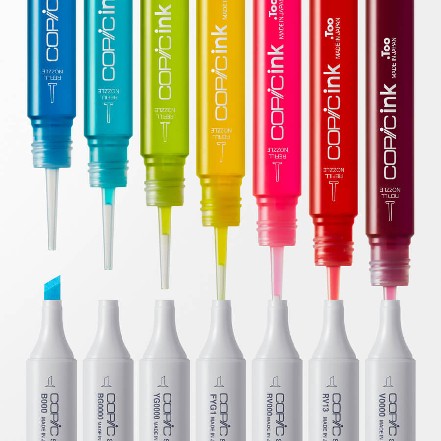
A brand new refill is introduced with an innovative user-friendly design. Copic Ink replaces Various Inks.

Our color history
It all started with 71 colors
The history of Copic's colors began when we inherited the colors of the Speedry markers, which were available before Copic. Copic markers were mainly used for comprehensive layouts for industrial design (for industrial/mechanical products and automobiles) when they were first released. A total of 71 colors were released initially, including basic colors such as red, blue, and yellow, their complementary colors, neutral colors, and two shades of gray.

Copic’s popularity rose among designers, who started to seek new colors for architecture and figure drawings. After two years after the initial release, 71 new tones were added to meet these needs. In addition to earth and beige tones to draw characters, two new gray lines, “neutral gray” and “toner gray” were added to the existing “cool grays” and “warm grays” models, which became the gray lineup that we all know.
New uses
In 1991, pastel and earth colors (that can be used for skin tones) were added to meet the demands of the fashion industry. Although Copic was born in Japan, it landed in Europe soon after its launch.
Copic was well accepted mainly in Germany, and we expanded the range of colors with the input of local designers, with consideration that Copic can be used regardless of the region. We added more greens, which are essential for architectural and environmental design, and increased many shades in the earth color family.

Around the time we reached 214 colors, the original marker numbering changed to the Copic Color System. Our Copic Color System is a combination of the elements of "color family", "saturation" and "brightness" to make it easier to pick and manage colors.

Create the colors you want to use
In the late 90s, Copic was widely used not only in the design field but also in the comic illustration scene.
We conducted research and developed colors based on the result of event surveys such as Comiket (the world's largest convention for self-published manga) and feedback from professional manga artists.

We added the "000" series such as "BV000" and "R000", which are very pale tones that extend the human skin rendering range and colors that can reproduce colors used in fashionable clothing. We added new 96 colors in 4 years.
After that, we developed the "0000" line of colors, which are ultra-pale tones even lighter than the "000" series.
The newest tones were added in 2012 to respond to the increasing need for the craft market, and the color lineup reached the current 358 colors.
Our commitment to meeting user requests is reflected in our other products as well. We will continue striving to create Copic products to satisfy the needs of our customers.


